
Power BI – Dynamic Page Navigation
By: David Rohlfs
Introduction
Have you ever thought Power BI could do more? I love finding ways around set factors in power bi like look at data, writing back, or a need for Power Apps to build create the “App” feel in Power BI. Dynamic Page Navigation makes this sooooo much easier and kind of cool (cool to the other data nerds like me).
In this blog we will go over what Dynamic Page Navigation is in Microsoft Power BI, when you should use it, some problems you may find, and a short walkthrough setting it up in a report.
When to use it
Dynamic Page Navigation in Microsoft Power BI is still new (as of writing) so be creative! There are a few obvious areas when you should focus on having this functionality, but for most current reports, they are not set up with page navigation anyways. So, let’s focus on some of the more creative ways to use this.
My favorite use for this is when you make Power BI feel more like a Power App. Because we let our user have a “choose your own path” experience, there are opportunities to simplify the report. I want you to think about this like it’s two different experiences. First, we have our End User experience; this should feel seamless and linear. But we also have our background or developer experience; this can be a web of logic or simple. Because we are creating the report for the End User and we also can’t assume our end users are advanced enough to understand this logic, we should build our report for our End Users.
Let’s look at an example of how this behaves. We have our home page here, there is some basic information, but we haven’t reached our data pages. The user can set their slicers and choose options. Based on the options they choose, we can use a “Page Table” to help them navigate the report with only one button.

Common Problems
Page Names
- Page names are going to be your biggest hurdle when creating dynamic page navigation. If you’re like me then you usually name pages arbitrarily and rename them as the user’s request, BUT we should not do that here.
- If your page names change, you must change your formula or your table to reflect. All values are Case Sensitive, and it needs to be the same as the entire page name (including leading/trailing spaces).
Back Buttons
- Because we are potentially navigating through a web of pages with only one page visible in Power BI, having back arrows becomes crucial. Whether this is a true back arrow to the page you came from or a faux back button sending you to a specific landing page.
Walkthrough
The walkthrough on this function is simple, especially if you’ve done any conditional formatting before. There are three parts, first we need to build a Page Table. This will be our dictionary of how our report looks and feels. Then, we will create a measure and slicer to set up the dynamic aspect. And finally, we will hook our buttons up and watch it all work!
Part 1 – Creating our Page Table
Before we start, I recommend building as much of your report as possible. We will use Case Sensitive page names, so if more pages are added, you need to revise this table.
Our goal is to create a simple table that Power BI can read to determine parameters required for what page to navigate to. These Parameters are filtered by using the SlicerFilter columns. We can simply create slicers that hold these values so the End User can select their options and have their pages filtered down by those options. This example is fairly simple but think about what it would look like if there were 5- or 10-sales page options alone!

Let’s also look at our report quickly. We have several pages and you can see I’ve named them in “developer speak”. Our Page Names are not going to be visible to the End User, so unlike most Power BI reports, we can keep these names more formal.
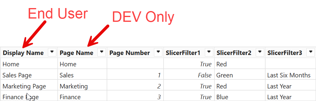
Some other examples of pages you may have are:
Home Page
Slicers/Filters Page
Main Data Page
Sub Data Page
Drill Through Page
Now let’s build out our table. We can do this in excel then copy paste it to Power BI later.
I like to start with my Page Name, Sort By, then my parameters.

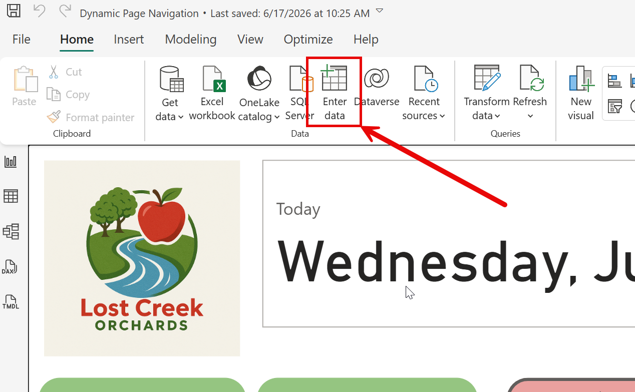
Once you have that all ready, let’s copy it into Power BI. In Power BI Desktop, find the Home Ribbon and select “Enter Data”. This is how you can enter data natively straight into Power BI. The data is held in the Semantic Model, so it stays with the report and doesn’t have an external data source to keep track of.
Then we just copy paste our table and click Create.
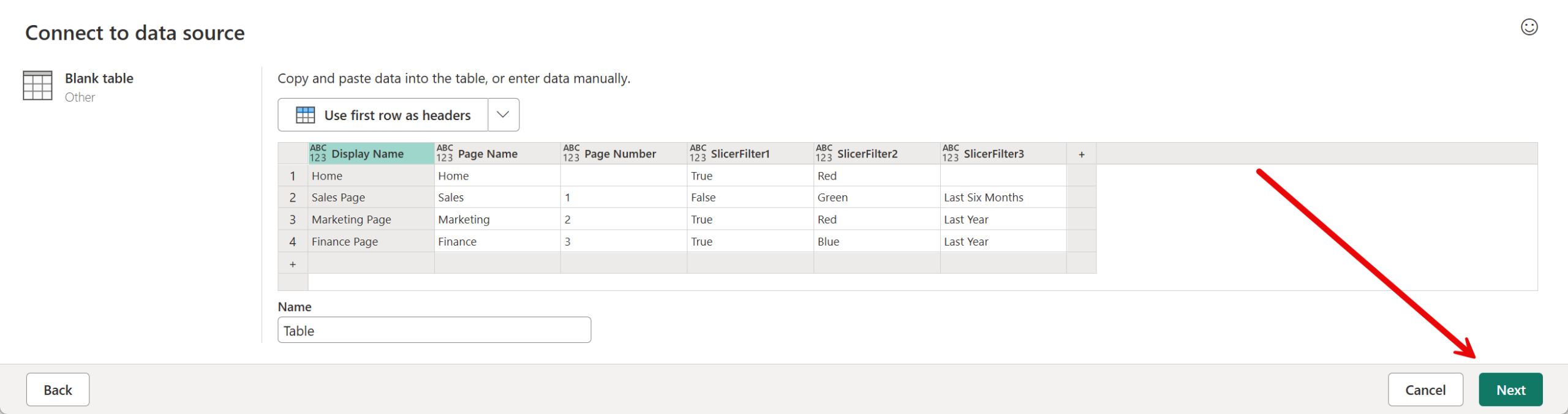
Once we get to Power Query, go find your new query. Rename it if needed.
If you need to change your table, click on the gear icon next to Source in the Applied Steps.

Finally, you can hit the Close and Apply button once everything looks ready!
Part 2 – Creating our Slicer and Measure
Now that our Page Table is ready, we can start creating the End User Experience. We are going to start on our Home Page, but this final button can end up anywhere.
First, let’s add our Page Slicer. Add a slicer to your page then we are going to add the “Display Name” column (I don’t recommend doing the literal page name column because I tend to use the dev/industry names instead of the business terms).
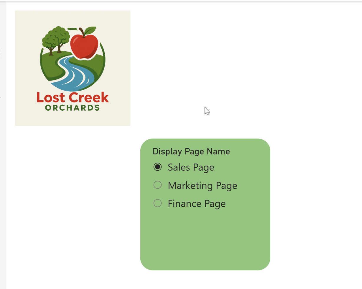
Next, we can add our other slicers. You may have none, but if you are using home page slicers, please review Sync Slicers and how they work.
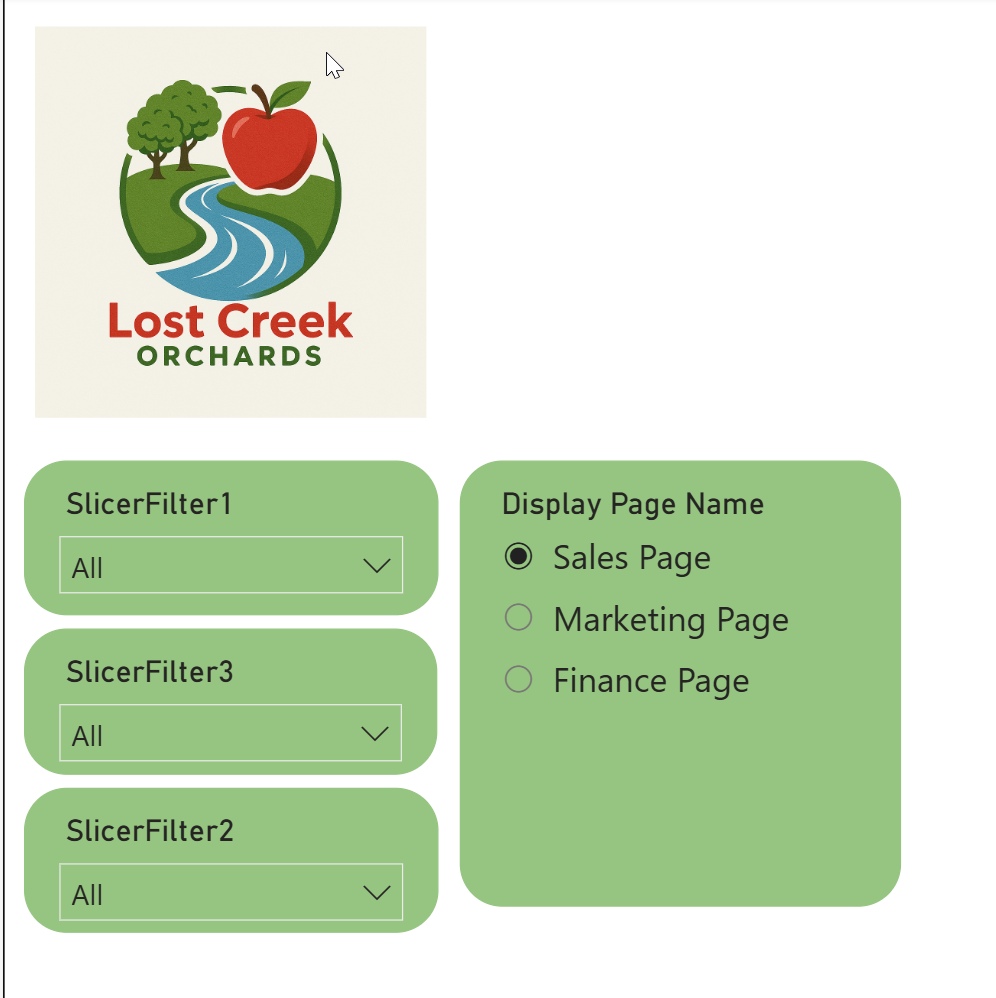
Now we are ready to create our Conditional Measure! This is very simple; we are going to use a selected value on our Display Name column to get the value that the user selected on our slicer. Then we are going to filter our Page Table for the first Page Name so that we can navigate there.

Once we do that, there are a couple of optional, but recommended, changes to make. First let’s set our Display Name slicer to a Single Select in the format pane.
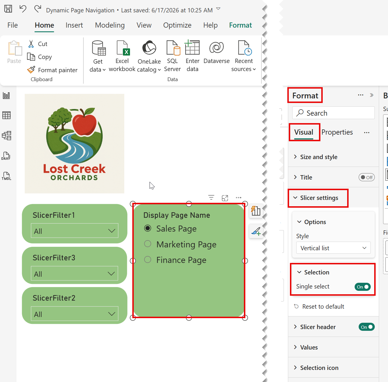
Next, let’s sync our slicers. You need to have all the slicers that are represented in your Page Table in all the active pages. In the View ribbon, open the sync slicers pane. Select your Display name slicer and then we want the sync option on ALL pages. For this case, I only want the display name slicer visible on the home page, but you can have this visible if desired.
Part 3 – Creating the Button
Finally, we need to create our button. Very simply add a button to your Home Page and go to the action in the format pane.
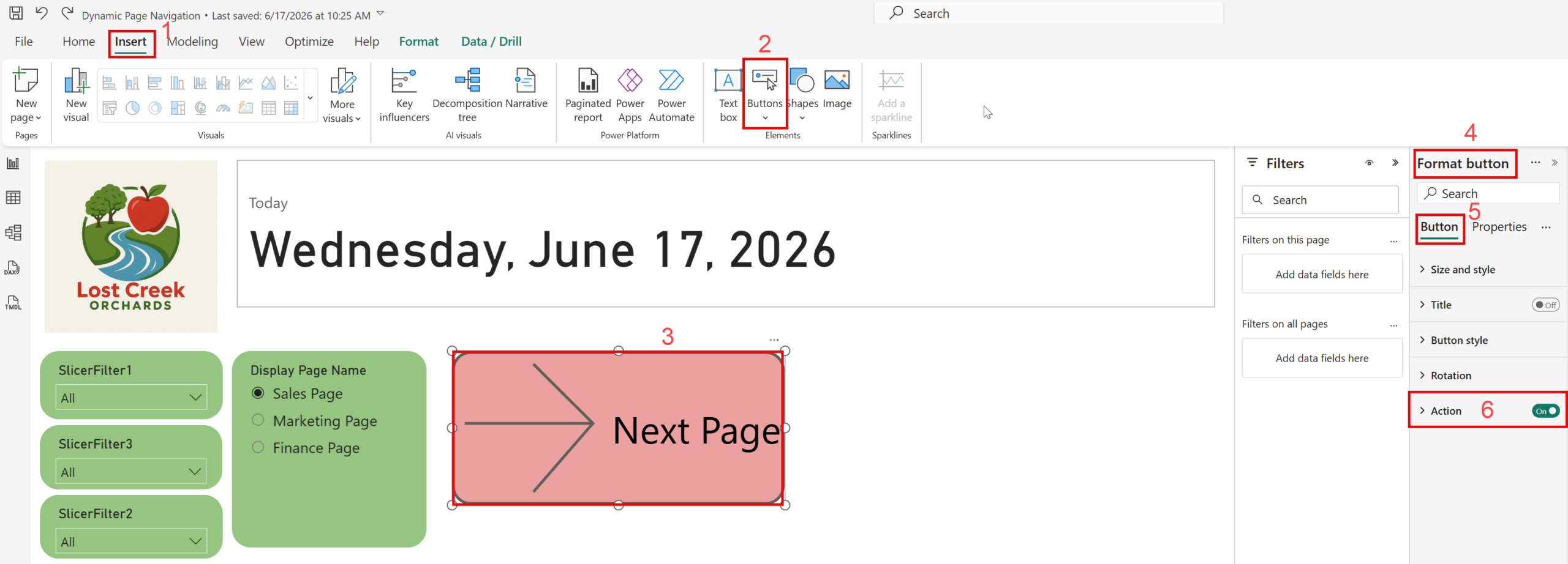
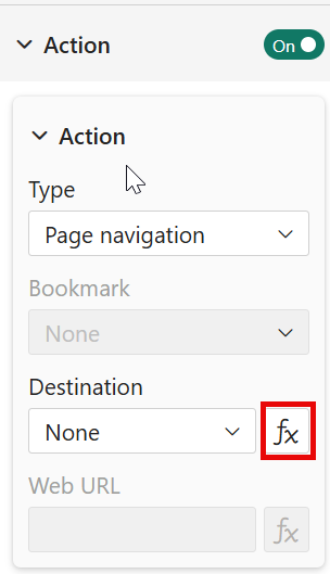
In the Action section of the Format Pane, we are looking to set the Page Navigation to a conditional measure. Select the little “fx” icon and find the measure you created in Part 2.
Finally, it’s time to test it! Start trying to navigate through your report now, if you have issues, I recommend placing your measure in a card to see the value it passes.
Conclusion
While Power BI is made for reporting, it has a lot more functionality than you may think. With Dynamic Page Navigation, you can give your end user that “app” feels inside of a Power BI report! If you enjoy this blog, please think about checking out a few of the related blog posts below.
Links Related to This Blog:
Power BI – Conditional Formatting
Comments
Leave a Reply
You must be logged in to post a comment.