Business Intelligence – POWER BI
Data, Data, Data – Data is everywhere! How are you able to manage it all?
Do you use Excel? Power Query? SSRS? Tableau? Qlik? Cognos?
Is the right information getting to the right people? Are they able to interact with it? Do they have to request a report from a specialized group of folks that will get back the information when they get to it?
Is your critical business informational data sitting in undecipherable rows and rows sorted in columns and columns of numbers and text that make your eyes glaze over?
EPM Strategy is here to help you with all those issues. We are certified in Power BI – the latest and fastest growing visualization tool for business intelligence. Power BI is a suite of business analytics tools to analyze data and share insights. Power BI allows you to interact with the data in a visual manner. Data and all of your information no longer has to reside in huge black and white rows and columns!
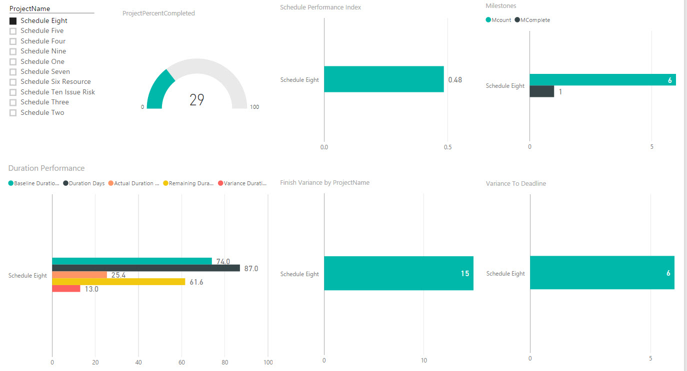
With Power BI you can share your visual dashboard with your employees or other key stakeholders. AND, they can interact with that information without ever getting to the underlying data set. They only see the parts of the whole that you want them to see! In one glance, anybody with the appropriate permissions can view the information that you want them to see in one dashboard view. For example, here is a simple dashboard screen that shows the Project Percent Completed, Schedule Performance Index, Milestones, Duration information (Baseline, Actual, Remaining and Variance), Finish Variance and Variance to Deadline – and it can be for one single project (as this shows) or for multiple projects:
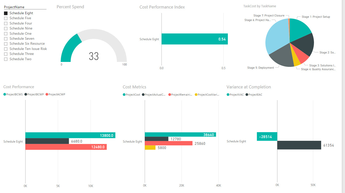
Or, what about a view by Cost? This screenshot shows a dashboard with the Percent Spend, Cost Performance Index (CPI), Task Cost by Task Name, Cost Performance (BCWS, BCWP and ACWP), Cost Metrics and the Cost Variance at Completion:
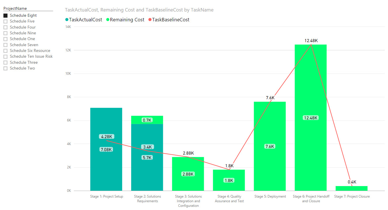
This third example shows the Actual Cost, Remaining Cost and Baseline Cost for the Phases of the selected Project(s):
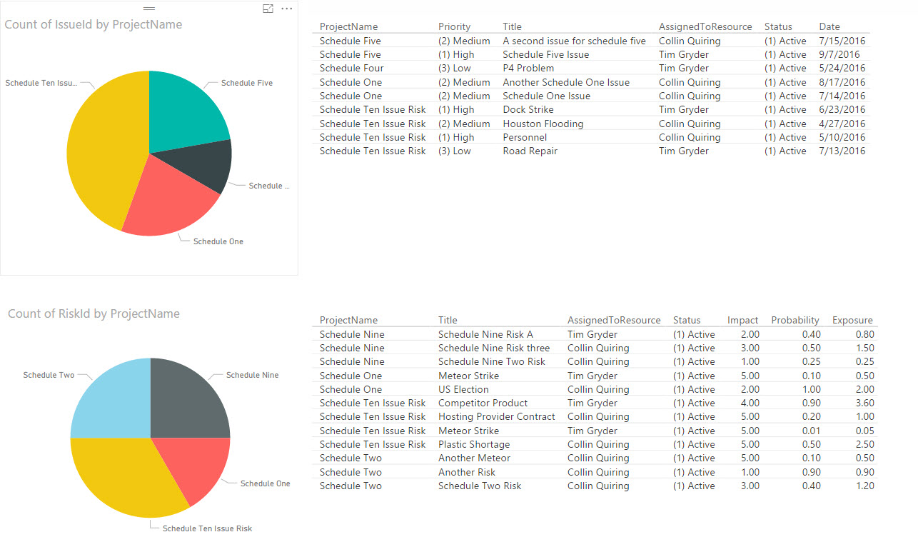
This example shows the Count of the number of issues for each project and the priority, title, assignment, status and Dates. It does the same for the risks on the bottom half of the screen (along with probability, exposure and impact):
Being able to see your data in visualizations allows for you to have a deeper perspective of trends, current situations and opportunities that are not as easy to determine when looking at a plain spreadsheet.
Power BI allows for data to be sliced and diced based on the needs of the users. You can now deliver the data that is needed in a very visual and easy to understand manner.
And, Power BI integrates with almost any type of data you have and where you have it. Power BI is designed to provide a comprehensive end-to-end business intelligence analytical ability for almost every tool that you are already using.
For example, this type of visualization is easy to see and understand the “big” and the “small” – this visualization could be used for data points like “Who is our biggest customer?” or “Which project is costing us the most?” or “Which market is our largest share?”

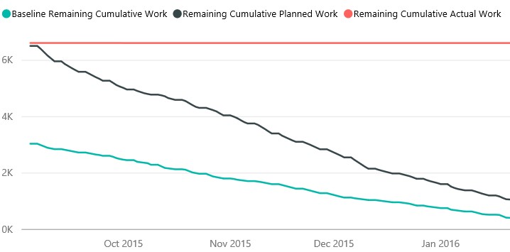
This is a simple image of a schedule’s Work – the Remaining Work, Baseline Work Remaining and the Cumulative Work expended.
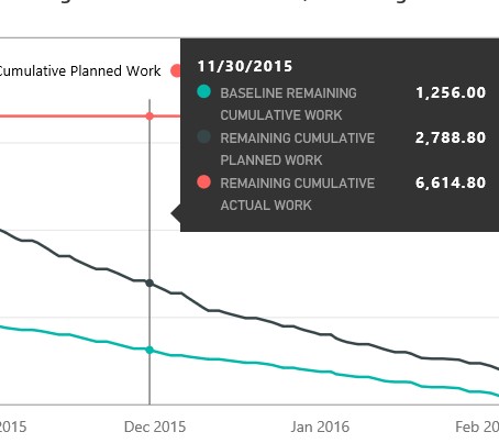
And, you can hover over it at any point in time to get a more detailed overview.
EPM Strategy can help you turn your data into action. Contact us here today!
