Power BI – Conditional Formatting
BY: David Rohlfs
Introduction
A table in Power BI is very bland and can be hard to read. When the goal of building a report is to develop interest of the data through a story, a report builder should try to avoid boring or straining visuals if possible. To help do this many reports contain conditional formatting. Conditional formatting, in the sense of this blog, allows for a color-coded column on any matrix or table in Power BI.
In this blog, we will go through when to use conditional formatting, some common problems that are associated with conditional formatting, and a walkthrough of how to set up conditional formatting on tables and matrixes.
When to use it
Conditional formatting is very useful if you want to color code your data. What this means is that you can have a whole column one color, apply rules so that certain portions of your data have conditional formatting, or use a measure to develop rules for your data. We are going to focus on the first two examples, but if you want to learn more about conditional formatting through DAX, you can look at EPM Strategy’s blog on Conditional Formatting with DAX.
Using conditional formatting allows you to apply colors to a column. This can be helpful if you have a column that you want your end-user to focus on, or maybe you have an outlier in your data and want to highlight it for your report.
The second way of using conditional formatting is by applying rules to your data. For instance, if you wanted to show all negative numbers in red, positive numbers in green, and your top 15% of sales in blue. For any report that has a focus on tables or matrixes, this creates a value to report builders that is a must have.
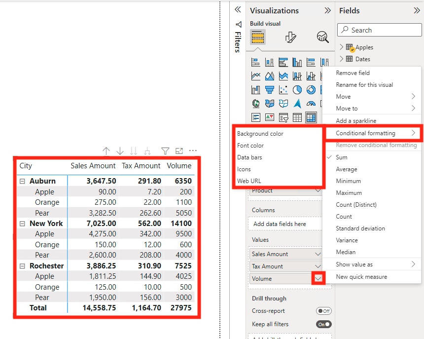
There are many ways that conditional formatting can be applied to your tables and matrixes. Such as:
- Background color
- Font color
- Data bars
- Icons
- Web URL
The main conditional formatting that is used is the background color. It is often the easiest to read, and very simple to set up. In the Walkthrough section below, we will go through all five conditional formats, and the different rules to set them up.
Common Problems
One of the more unclear aspects of creating conditional formatting rules is how the Minimum (min) and Maximum (max) values work. The way that the equation is formed makes it that you must have both a min and max, so you often end up using 0% or 100% as your min and max respectively. This can make it difficult to assign number values to a min or max and is one of the driving reasons that I prefer to write my conditional formatting in DAX.
Walkthrough
In this walkthrough we are going to go through accessing conditional formatting and what each method does. In this blog we are only talking about tables and matrixes, so while most other conditional formatting is like these processes, this blog will not cover conditional formatting for other visuals. For each of the below examples, we will be using Example 1 for the process to open your conditional formatting. In all my examples I will be using a matrix that I pre-setup with two row layers and three different values.
Example 1
To open your conditional formatting window, click inside of your table or matrix. Then select the down arrow on the column that you want to apply your conditional formatting to. You will see a list pop up with all the actions you can take, but for now select conditional formatting and which format you want to have.
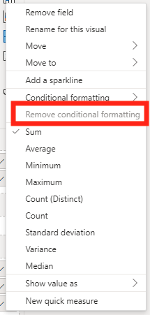
If you want to remove your conditional formatting, the easiest way is to select the Remove Conditional Formatting option, then select the formatting you want to remove.
Example 2 Background Color & Font Color
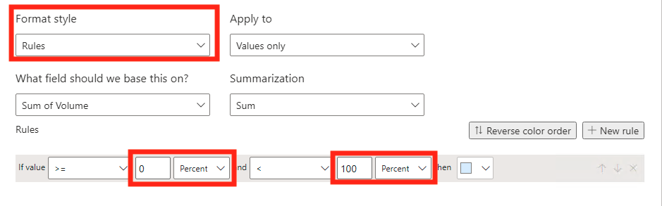
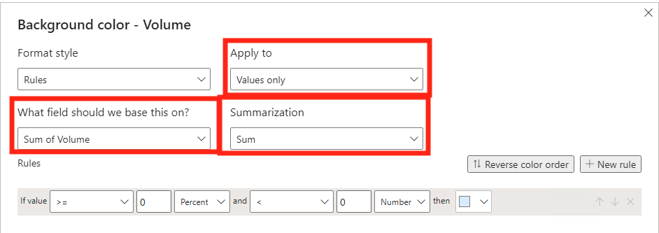
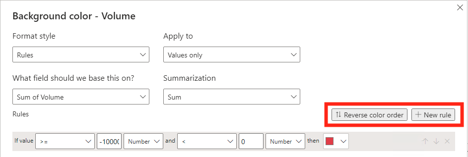
Background color and Font color conditional formatting is the same process, so we are only going through one example for each. After you go through example 1 and select your formatting, a new window will come up to develop your formatting. The Format Style is where you choose if you want a gradient, applying rules, or using a measure. For this example, we are going to select rules.

Once you have selected rules for your formatting, you want to review the other three boxes at the top of the window. The Apply to box is where your color will end up. You can choose to have it be on the values, totals, or both. The field that you are basing your formatting on will most commonly be the field you are already in, but if you are using a separate field, this is where you would let Power BI know that. Your summarization is the aggregation you are performing so that Power BI can apply the formatting. Most of the time this will stay as sum, but you can select the other options also. For this example, I am leaving all the dropdowns in their original positions.
Now we get to apply our rule. For this we are going to split the rule into three parts.

In the If statement we have our minimum value for the rule. I usually change the percent to be a number, but that is because I like my rule to either be in only percent or only numbers. You can also change the >= to complement your preferences. For this example, I am entering -1,000,000.

In our And statement we are doing the same process as before, but with or maximum number. I want my expression to only represent negative numbers, so I am entering 0 into the number slot.

In the Then statement we get to choose our color. I am choosing a red to reflect our negatives.
![]()
Now you can add more rules by clicking the + New Rule and add more formatting to your field.
Once you are finished building your conditional formatting, you can click OK then check if the formatting worked.
Example 3 Data Bars
The data bars allow you to show a progression of background color. When you select the data bars, you will see a window like this.
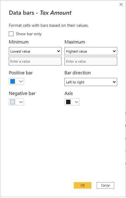
If you want to, you can select the Show Bars Only, and your text will be replaced by the formatting. You can use your min/max field value, a custom value, you can choose the direction of the bar, and which colors you want for the formatting.
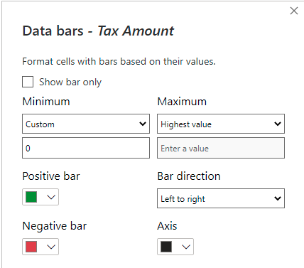
In this example I am going to make my minimum be 0 then my positive green and negative red.
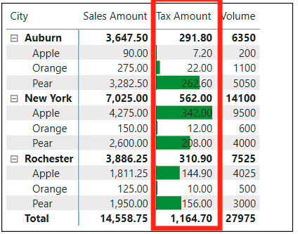
Here is what the data bars look like after they have been formatted.
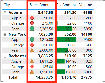
Example 4 Icons
The Icons conditional formatting is like the background and font from Example 1, but it differs by apply different Icons to your data cells.
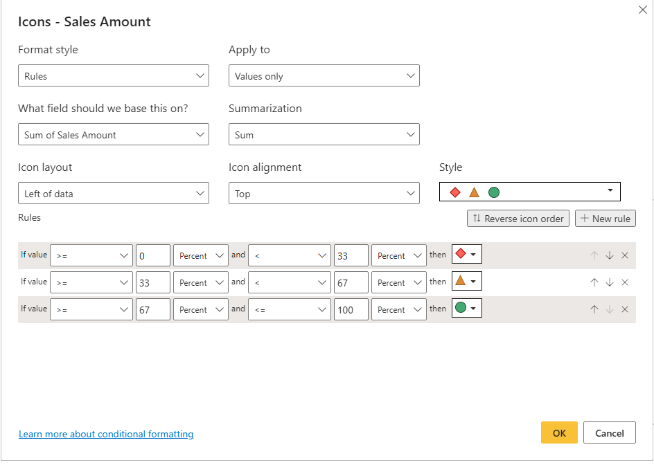
You will set up your data the same way as before, but instead of colors you can choose the icon you want to present. You can alter the Icon Layout, Icon Alignment, and Style (Which Icons).
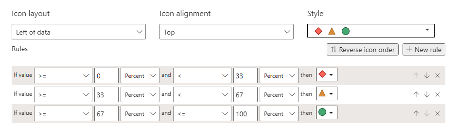
For this example, I am going to show you the original rules that were displayed.
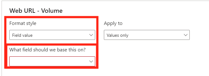
Example 5 Web URL
This example uses a separate table to connect your data to a URL Link. This is more like building a DAX measure and using the Field Value option in your Format style.
Conclusion
This blog went over a concise description of what conditional formatting is and how it works. Although the examples can seem daunting with how the rules work to build them, they often get easier over time. If you want to learn more on conditional formatting, EPM Strategy has also published another blog on using DAX to create conditional formatting for matrixes and tables.
Comments
Leave a Reply
You must be logged in to post a comment.