Power BI – Formatting Column Headers in a Matrix Visual in Power BI
By: David Rohlfs
Introduction
Recently I came across a scenario where I wanted to have conditional formatting on a column header for a matrix visual in Power BI. When working through this I quickly realized that this is not such a simple problem, and it takes a work around to solve this problem.
In this blog we will go over when you can apply conditional formatting to a matrix visual, some problems that you may encounter, and a short walkthrough demonstrating how to apply conditional formatting to the column headers of a matrix visual.
When to use it
Like I said in the introduction, this is not a solution to a direct problem. We are instead going to use a work around to solve this problem. Instead of organizing our data to the categories defined by a field in the column value, we are going to create individual measures to place into the values field. If you aren’t able to create individual measures to define categories, I suggest reading through Common Problems below.
Here is the situation that I was in when this became a problem. I was working with someone who specifically wanted conditional formatting on a column name to relate to another visual on the page. The way that they wanted their data laid out was the exact way that a matrix formats itself with the subtotals and easy drill down, so I chose to use a matrix. Everything was setup and working until I got to the last part that was setting up the conditional formatting.

There is not a native way (as of my current version of PBI Desktop) to do conditional formatting on a column value in a matrix. So, I started looking around and a colleague of mine found a solution. This is to use measures to categorize the data into the same categories that would be the column values.

Essentially what our goal will be is to take the column categories and parse them out into their separate values by categories. So, we will be creating a list of measures that contains all of our categories.
Common Problems
I can’t create measures for my values.
It isn’t unreasonable to think that there are lots of people reading this blog who are unable to use a measure to separate out their columns. Doing this would get rid of the native column drilldown ability. Unfortunately, I haven’t found a way to solve this problem without creating individual measures. I think that this solution will be useful for lots of people, but there are definitely situations where this is not an option.
Measures aren’t created for new data.
If the categories that you would be placing on the column field change often, this method is probably not right for you. There is not a way that I know of to automatically create measures based on a list of values from a field. Maybe you can do this with another program integrated with Power BI, but probably not.
Walkthrough
In this walkthrough we are going to work on creating conditional formatting for only the column headers of a matrix visual.
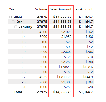
In this scenario I have a matrix that has the product name as the column with sales data as the values and some dates as the rows.
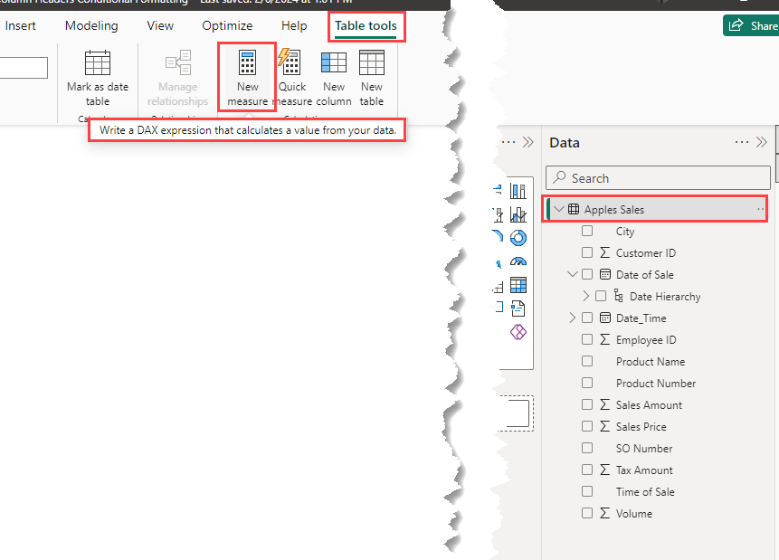
We need to create measures that mimic our end result by filtering on our categories. To do this we will be using the calculate function and a sum function in DAX. Click on the query that you want the measures to land in and select New Measure in the Home Ribbon.
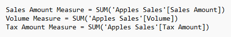
Now we can type in our function. I am going to use a name that can appear on my matrix easily, then use the calculate function to do the rest of my math.
![]()
Now we can repeat this process for all of the categories that we want to end up with. I prefer to open up a notepad and copy and paste my measure to help speed up this process.
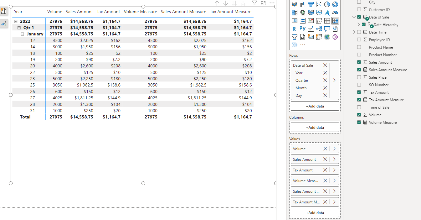
We are going to put all of these measures into the value field list of our matrix. Your matrix should look something like this.
Now we can go onto our conditional formatting. Click on the matrix visual and open up the format pane. You should see a section called Specific Column. Open this up.
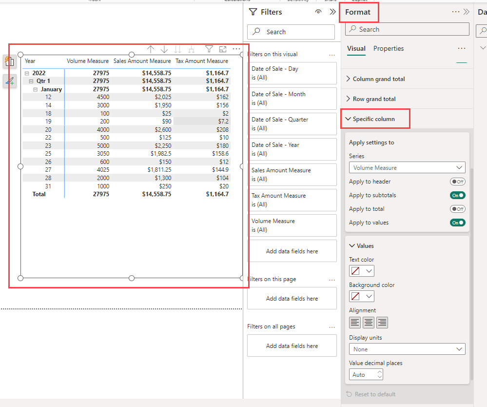
We can select the measure that we want to format first then only have the Apply to Header switch turned on. After this we can choose whatever background color we want.

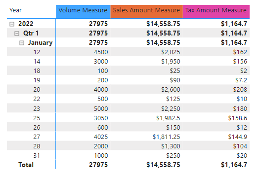
Once you do this for all of your measures you should have something like this.
When you are creating separate values, you won’t get a totals column automatically created. You can either do this by using Visual Calculations (very new and works great in this situation), or you can create a measure that doesn’t have any filters.
Conclusion
I know that it was hard for me to find a solution to this problem, so I hope that this has helped you. If there was something in this blog that you weren’t sure what was happening, I recommend looking through the related blogs linked below. Generally, I have done a lot of smaller blogs focused on basic concepts for more advanced concepts like this blog.
Links Related to This Blog:
Comments
Leave a Reply
You must be logged in to post a comment.