What is the Difference between a Table and a Matrix in Power BI?
BY: David Rohlfs
Introduction
When you’re new to Power BI there are a lot of aspects that are confusing or difficult to understand. When I started in Power BI and began building reports, I had very little experience in Microsoft Excel or any other report building tools. There were a lot of functions and especially visuals that I had to learn that weren’t clear and concise. One of these was the difference between a table and a matrix.
This blog is meant to cover some of the beginner level difficulties when entering Power BI. So, if you are NOT new to Power BI you may find this blog repetitive and/or full of pre-existing knowledge.
This blog will go over when you should use a table or a matrix, some of the differences between the two, and go through a short walkthrough demonstrating how to implement these visuals into your report.
When to use it
When I began learning Power BI, I started going through a couple of books and DIAD classes. These are great places to learn, but I found that my understanding of why you should use a matrix over a table was nonexistent. Unfortunately, I think that this may be true for many people who are just getting into report building with Power BI and I want to show you why you would want to use a matrix or table depending on the situation.
Tables are great at a few things, but they start lacking in a few areas. For instance, if you have a lot of data, it can be hard to read. Because they are often hard to read, they end up taking a lot of real estate while the end user is going to avoid looking through the few thousand rows of twenty different columns of data.
This is where a Matrix can be extremely useful and helpful in a report. Matrixes rely on a hierarchy that allows for an accordion effect on your data. We will get into it more in the Walkthrough section, but you are able to represent your data on the x and y axis with there being an aggregation in the value. Don’t immediately think that this value is bad because it is aggregating your data, but what it is letting you do is take those thousands of rows and tens of columns and condense them into a useable chart.
Now that we have gone through the introduction for each visual, I want to talk about some of the pros and cons of each. Just know that the lists of the pros and cons are not all inclusive, there are a lot of situations where you will find hat one visual is much more superior over the other and some situations where you could interchange the two and there is little to no difference.
Table Pros:
- Tables are great when you just want to show your data. If you have end users that are not experienced with data reporting or are not good with reports that require interaction, a table is very stable and predictable.
- Tables are much better for a mobile view. When you are working with developing a mobile view, one of the strongest rules that I suggest is that you recognize that your user won’t want to interact as much with the report. This is for several reasons, but the biggest being that a mobile view is smaller than a computer. Note: There will be a link below on building a mobile view for Power BI.
- Tables can be the subject of a report page. This is true for both tables and matrixes, but when you are building some of your first reports, you will find that you only want to have one or maybe two main visuals per page. By this I mean visuals that are representing the data, so not cards or slicers, but the table that will be the focus of that page. In the same way you can also make a table into a supporting visual very easily. This is great because it shows a lot of versatility for one visual.
Table Cons:
- Your data is always expanded. When you work with a table, there are no hierarchies or collapsible aspects that you can get with a matrix. This might be fine with you and your end user, but it is a downfall of using a table over a matrix. When I run into this issue it is generally because I am using a table as a supporting visual and not the main subject of a page.
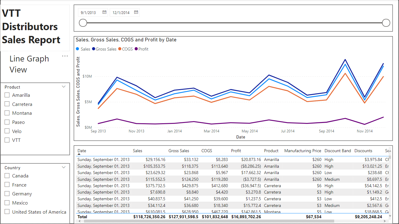
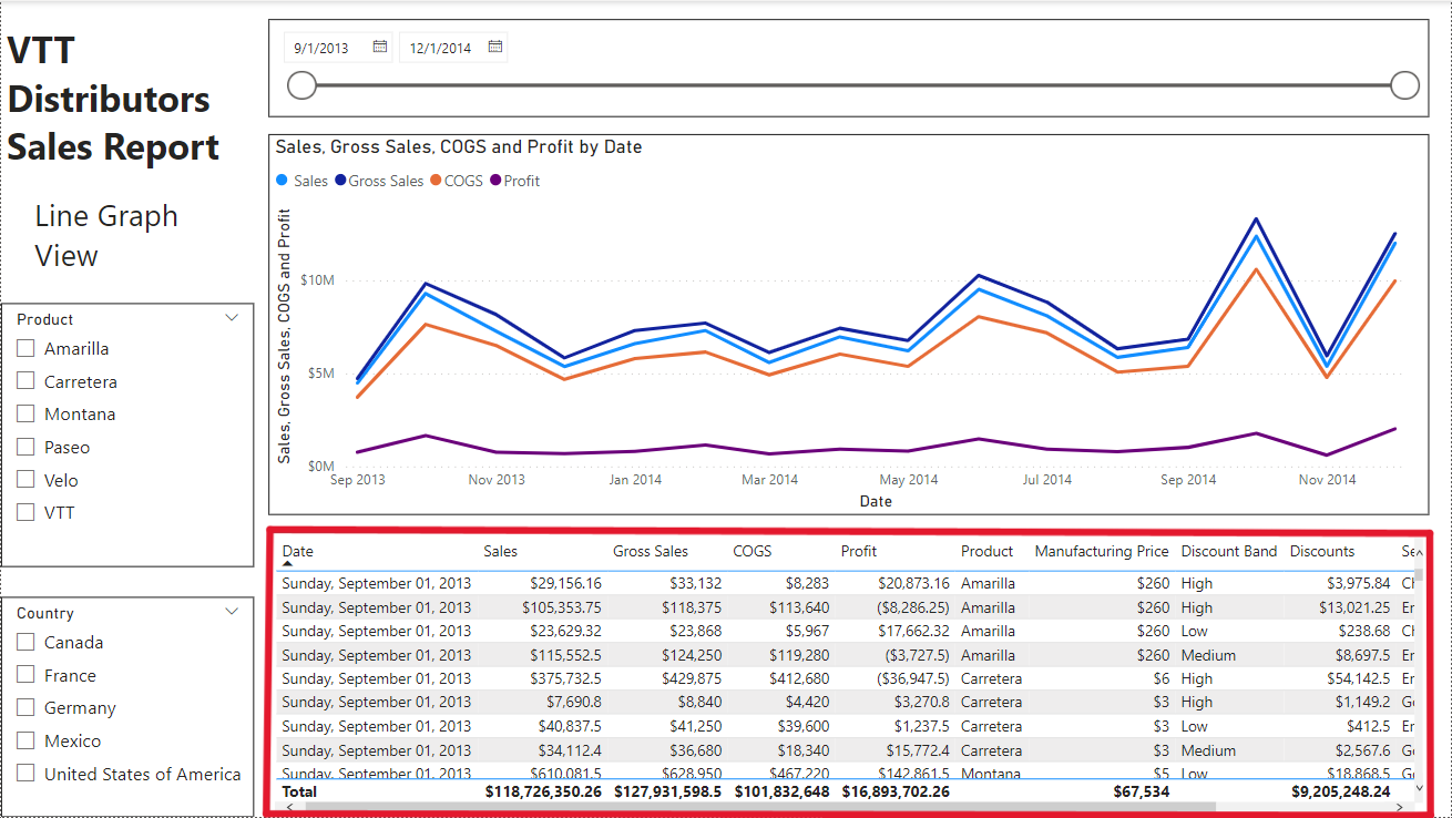
- Tables just aren’t as clean as they can be. There is a lot of data shown by a table that you need to represent, but it just doesn’t always represent itself well. For instance, when I show you this line graph versus this table, what differences do you see? Is it that you can easily see the trend through the years, or that you can see the relationships between the different amounts of money (COGS, Profit, etc.). These are some of the reasons why I avoid representing data in a table that could easily be shown with a graph. Note: Sometimes your end user will want to see a table view rather than a line graph. The entire goal of being a report builder is to create reports for the end user. Sometimes tables represent information in the way that it is needed.
Matrix Pros:
- Matrixes are great at being concise. Ninety percent of the time that I choose to use a matrix because I have so much data and so little space to represent it. Because of a matrix’s ability to create hierarchies, you can take extremely large amounts of data and throw it into a visual that can be vary small. But the difference when using a matrix is that you can still expand upon the different levels to see all your data. With this you are letting your end user decide how much information they want to look at and you are allowing them to explore the intricacies of the data that they are reading.
- Matrixes are much better at showing dates than a table. You can always choose to show your data with a graph or chart, but if you’re restricted to showing your data (that has date information) in a tabular form, a matrix does this very well. Because of a matrix’s ability to expand and contract, you can easily set it up so that you can drill down into a year, quarter, month, or day. This lets your end user determine how much information they want to see.
Matrix Cons:
- Your end user must be interested in learning. Unlike a table, a matrix requires that your end user interacts a lot with the report. For many end users this is exciting and more fun than just looking and reading, but not every end user is alike. For that reason, if your end user avoids interacting with a report, then a matrix is not a good choice.
- You may need to set up relationships for your matrix to work. This still applies to tables, but when you start creating hierarchies with your data, it is much more common that you will be using more than one query in the same visual. Because of this you need to set up a relationship so that your data can work with each other. If you need to learn how to do this, then you can read through the basic relationships blog linked below.
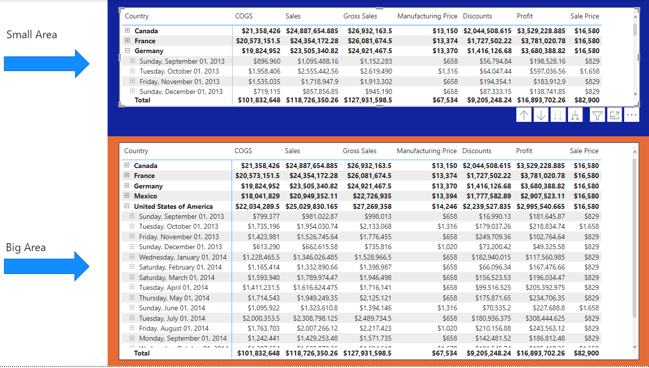
- A matrix can take a deceivingly large amount of reports real estate. A con of having a visual that can collapse a lot is that the same visual can expand a lot. If you do not test out how much space you need to effectively read a matrix, your end user could easily be put off of the idea of a matrix. Here is an example of a matrix that was set up with no reading room and a matrix that was set up with reading room.

Walkthrough
Because this blog is mainly to represent when you would want to use a table over a matrix and vice versa, the walkthrough section will not be extremely in-depth. My goal is to show you some of the main attributes to each visual and represent some of the pros and cons that we went through above. Thus, if you skipped the When to Use it portion of the blog, I would suggest that you go back and read it before you go through this walkthrough section.
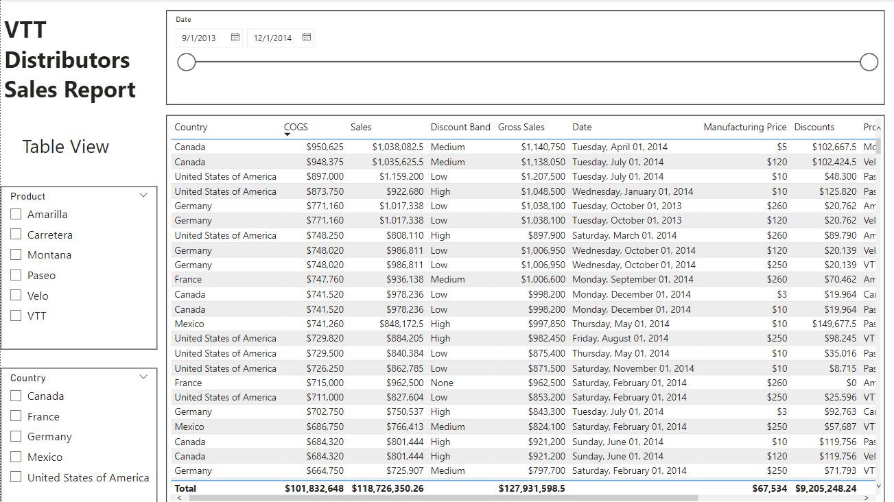
The biggest thing that you should know with a table is how to sort the columns. To do this you just need to drag and drop the field in the columns list. From the top to the bottom in the Columns list is your left to right on your table. So generally, you will want to keep your category fields (date, country, region, product, etc.) on the left side of the table.
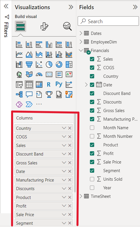
The next thing that you should see with a table is that if you have it as a secondary visual in a page, you represent the data from the primary visual. Usually when you build a table as a secondary visual it is because you are wanting to expand on some of the information from the primary visual. In order to do this effectively you need to represent some of the main fields from the primary visual as well as some fields that may not be in the primary visual. In this example we see that dates, sales, and products are the focus of the primary visual (Line graph). But in the table below we show more information like the Segment and COGS. It is important that you show more information with a table than you would with a graph visual.
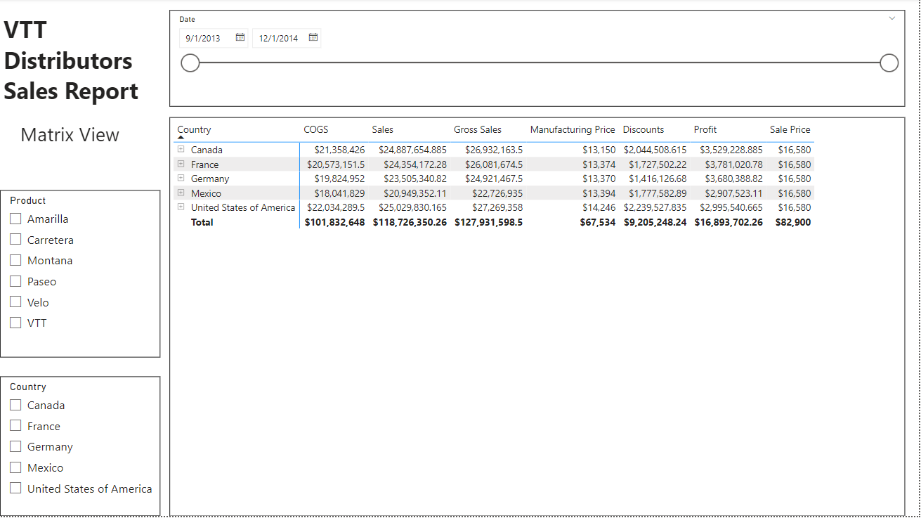
A matrix has a special place in any report. For many people who have used excel to report and have been stuck with thousands of rows of data to sift through, a matrix that creates hierarchies is a huge step up. The difficulty with a matrix though is that you need to become proficient in understanding the hierarchy system. It all comes from the three sections of the visual. There are Rows, Columns, and Values.
- The rows will be on the left side of your matrix. In these I suggest anything that is a category you will want to sort by. This is where you will contain the bulk of your fields. Be cautious of adding so many fields into this section because you want your end user to be able to easily see all the information while also being able to look at specific points of data.
- The columns will be on the top portion of the matrix. In a column I usually only use something like a date or much broader category. For instance, if you have a report that shows regions in a country, you might want to put that field inside of the columns. This is because your user will only want to see the region if they want to see the region breakdown. So, if you had this is the rows portion, you may be overcrowding that section of your report. Unfortunately, there isn’t a great way to differentiate what should go in the rows and what should go into the columns, but you should use your best judgement to what your end user will want.
- Finally, the values are exactly that; they are the values of data that you will want to show. Normally they will be aggregated into a value that you choose. This is the largest difference between a table and a matrix. When you aggregate a value, you are heavily suppressing the ability to look at a specific point of data. Thus, this is both a pro and a con of the matrix.
Conclusion
There are a lot of aspects to building a report that may be hard at first to understand. Things like keeping the end user in mind and how others will read the data are hard to predict, but that is one of the challenges of being a report builder. This blog was only meant to give the most basic reasons why you would want to use either a table or matrix in a report. So, if you do keep on building reports, I highly recommend that you start exploring where you can alter a table or matrix within the visualizations options in order to have it better represent your goal.
Links:
Power BI Basic Relationship Building
Comments
Leave a Reply
You must be logged in to post a comment.