Power BI – Using Shape Maps, KML files, and Zip Code Lists in Microsoft Power BI
BY: David Rohlfs
Introduction
Not too long ago I ran across a request to create a shape file that could integrate into Microsoft Power BI, and of course this opened a rabbit hole of questions and opportunities. Because of the discoveries while I was searching on the internet and creating my file, I want to create a blog that explains some of the capabilities and possibilities that using a shapefile has with Power BI.
This process will be using Google Maps to create a KML file, convert the KML file into a TopoJSON, upload the TopoJSON to Power BI, and get a list of Zip Codes from the KML file.
A portion of this process is described by mjfulke on the Power BI Community Forum. Here is the link to that: Create Your Own Custom Map for Power BI – Microsoft Fabric Community
In this blog we will go over how and when you should utilize a shape file in Power BI, some problems that I found while using this process, and a demonstration of the entire process.
This blog will be using a lot of advanced and complicated concepts. So, if you find it hard to follow, I suggest re-trying and starting with simple data.
When to use it
Integrating shape files into Power BI has a lot of potential when you want to work in reporting, but it also can have some very helpful insights when you are talking about zip codes. While you can become creative and use shape files to represent anything, the most common use that I see for it is with maps and territories.
Let’s start off with what would not be worth the while of going through this process. Because building a shape file on a map is such a long process, there are a lot of times that it just won’t be worth it. Some of these are:
- When there are already predefined borders for a location. These are like counties, states, countries.
- If your end users do not want to utilize the report. This process is not short and will require a lot of tweaking after the first draft is done. So, if your end user is not excited about the idea, it may not be worth pursuing.
- When the data just isn’t very important. There is always data in a semantic model that shouldn’t have a lot of time dedicated to it. If your data falls in this area, it probably isn’t worth the effort to create a custom shape map for it.
- When this is the first visual for your report. Even though this is a cool visual to add to a report and show your end user, it is time consuming and has a lot of moving parts. One of the problems with spending so much time on one visual is that if your data isn’t correct and you put it inside of a custom visual, it is very difficult to know whether the visual is bad or the data is wrong. If you do choose to create a custom shape for your first visual, there will be a lot of time spent in validation to check whether your visual and data is correct.
While there are a lot of times not to build a custom shape map, there are still sometimes when it is very worth the while. Some of these are:
- When you have a list of territories that are not pre-defined. Having a visual diagram on a map of territories helps a lot to tell the story of your data. Sometimes the visual representation of the data is just as important as the data itself.
- When your end user is experienced with a report and wants to have the next level of depth. This goes along with what the first bullet point is, but you should have an end user that is willing to wait for this visual and sees the importance that it can bring.
One very important thing to note is that whatever level of effort you put into creating these shapes is what you will get out of them. If you put together a map of the US in twenty minutes, there are going to be a lot of quality differences compared to spending five hours on the same map. So, you should pick and choose your battles where you spend your time.
One way to speed up the process of using a shape file in Power BI is by using pre-existing files on the internet. While you can’t change these files with the method that you are using, having a reference could speed up the process of building out your shape file. One example of this is with GeoJSON and KML data for the United States – Eric Celeste (clst.org). This link gives a few sample files that you can mess with and put into Power BI.
Something that you should think about when you are building out your shapes is how you differentiate the layers. While this method works without you creating a new layer for every shape, there are some benefits to doing this. Some of these benefits are:
- More versatility when you are finding zip codes. If you have separate KML files for each of your shapes, you can easily find the zip codes for just that shape. This will be shown in the last step of the walkthrough.
- You can hide specific layers/shapes. In the Google Maps custom map creator, you can select or unselect shapes to be shown on your map. This can become very helpful while building out shapes that may overlap with each other.
- Saves time in the future. If you have a single shape on a map that you need to get rid of for any reason, it can be easier to identify and delete a layer instead of finding the shape inside of your map.
Common Problems
There are a lot of spots that you can mess up in this process, and because of it this is a very tedious process. The problems that I found below don’t all have great solutions, but you can always just start from the last saved point. I encourage you to not give up on this process because the results can be very exciting if you finish.
Overlaying Shapes on an Existing Map
One of the large problems surrounding the use of shapefiles in Power BI is that we can’t have our shape file contain data points while layering an existing map easily. You can go the difficult route and start layering visuals and playing with transparencies, but there is not an integrated way to do this
What you can do is something like using the azure map in the walkthrough. The difference is that you can create a point inside of your territories and assign all the data to that territory on that point. This is somewhat of an arduous process but is very doable.
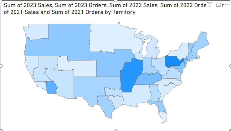
Keeping the Same Territory Name
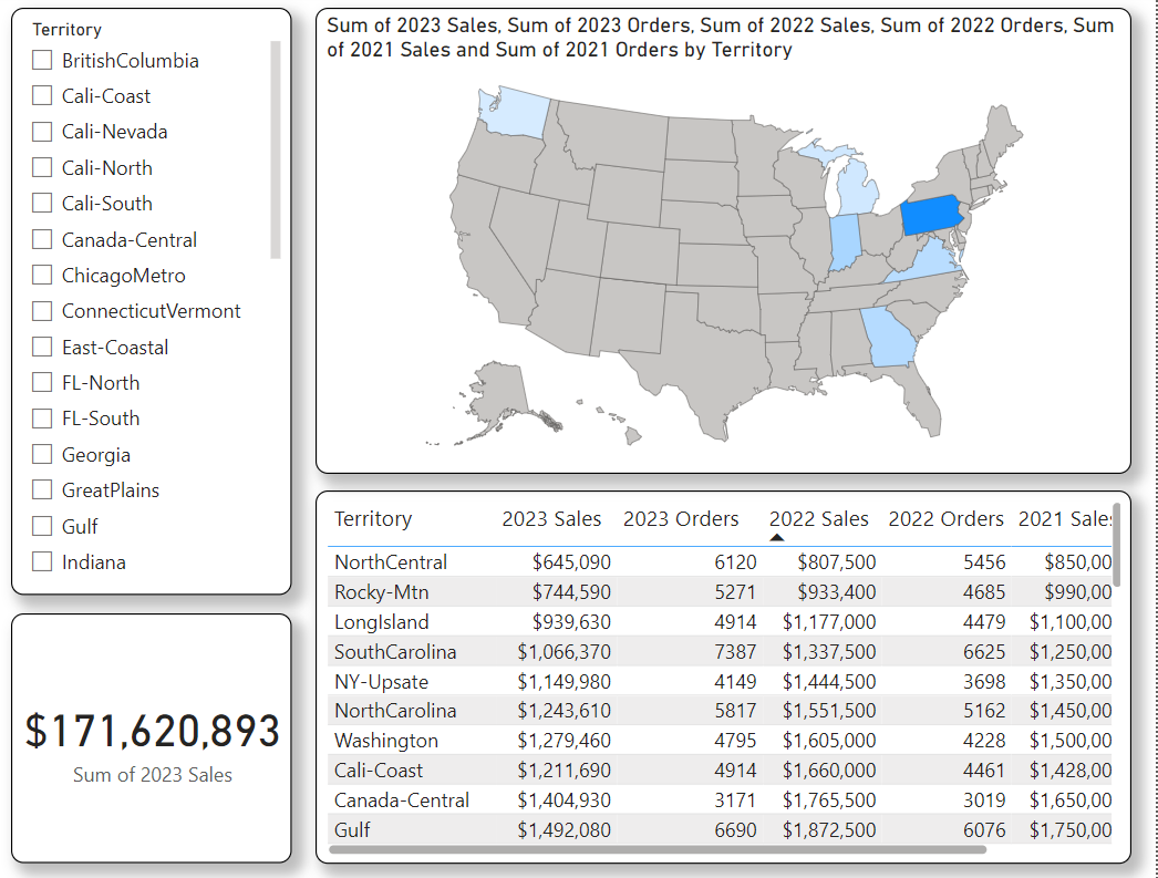
One thing that you are very likely to mess up on and need to redo is keeping the same name of your shape and your territory. Here is an example of a shape map that I do not have the same name for my territory.
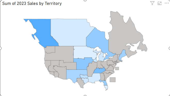
You can see that the territories that are grey do not have a connected territory in the data. What you can do is just go and rename the shape in your google maps then redo the rest of the process. Although it is tedious and time consuming, unless you know how to code in KML or JSON, there just isn’t an easier way to do this.
Creating a Line Instead of a Shape in Google Maps
One of the most frustrating problems that I have endured in creating a shape file is while using the Google Maps tool. When you are creating a polygon shape, the tool that you are using is also for creating a line. If you mis click and stop creating the boundary, you will automatically create a line. When you do this, you must start over! There is no way to turn a line back into a shape.
Bad Shapes in KML-TopoJSON File
On occasion, you will have a shape file that represents the shape incorrectly. This happens most commonly when you are creating a large shape, or the border is covering a large portion of a location. I experienced this when I had a shape whose location covered most of the world that was not the US or Canada. When the file is converting between a KML and TopoJSON, it isn’t uncommon that a shape will be turned inside out or have the inner portion of the shape be recognized differently. The easiest solution for this is to make smaller polygons inside of your KML file. If you are following this blog’s method, this may look like redoing a shape in Google Maps to create two shapes out of one.
Exporting KML as One Layer vs. the Entire Page
If you look at the original post on the community forum that this blog pulls from, you will notice that the steps include only exporting one layer of the custom Google Map instead of the entire file. Whether or not you do this is up to you. I have had success in exporting an entire file and just a single layer. This can become helpful if you want to split up your shapes by layer because it can give you some extra versatility when and how you use the shapes.
You Can Only Import Location Points in Google Maps
The method that I like to use to find a territory or region in the Google Maps custom map creator is by importing a set of data that contains points. While this is very helpful to identify points on a map that belong to a territory, it doesn’t create the territory for you. So, if you do need to import a set of data to a layer, just know that you cannot combine these points or shapes.
Not every zip code from the final step/getting all zip codes.
If you do choose to use the freemaptools.com link, you might not get every zip code on your list. While in an ideal world you would be able to easily find every zip code in the country, it is just not that easy. What this tool can do is give you most of the zip codes in a region. This is just because the developers of this site are likely not updating the list every time that a zip code is added or updated in the U.S.
Exporting KML vs. KMZ
While there may be benefits to exporting as a KMZ file while using shape files, the method that we are using is based on a KML file. This is simply because it works a little more smoothly with the process that we are using. If you do find a method that works while using a KMZ file, I encourage you to share this with the Power BI community on the community forum.
Bad Scaling in the Power BI Visual
If you are choosing to use the Shape Map in Power BI to represent your shape, you may have issues with scaling the shape correctly. In this visual, your shape is not being recognized as a map, but instead as a cluster of shapes. This is important because it means that the shapes will automatically fill to the size of the visual and not to a predetermined size by the report builder. If you choose to use this visual, just know that any change you make to the shapes in the future can affect the scaling represented by the visual.
Maximum Number of shapes in Google Maps Custom Map Creator
There is a maximum number of points that you can have in Google Maps custom map creator. For the most part this won’t be an issue for you, unless you are planning on having a very large number of detailed shapes. The maximum number of shapes that you can have in a map is 10,000 and the maximum number of points you can have is 50,000. For more information you can follow this link Draw lines & shapes in My Maps – Computer – My Maps Help (google.com).
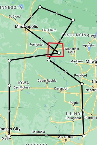
Invalid or Self Intersecting Section of Polygon
One problem that can occur is that you intersect your own line while creating your shapes. Here is an example of this:
If you are working with google maps and do this, you may need to restart your shape. You won’t get an error immediately, but once you complete your shape and connect the last point, you will get an error message and google maps will not let you create that shape in many cases.
Google My Maps Not Automatically Saving
A known error while working with google maps my maps is that you can stop automatically saving your changes. You will notice this by one of two things: your OneDrive save icon next to the title of your map may only show the rotating save icon, or you might get an error message in the top center of your map view. There doesn’t seem to be any solution to saving the progress you have lost so you will need to restart from your last saved spot. To do this you just need to refresh your page. Unfortunately, this can be a time killer if you are part way through a large shape, but there doesn’t seem to be any fix to it.
Changing the Location of JSON Files
Once you can visualize your shapes in Power BI you will need to go to a file that is stored somewhere to use your TopoJSON or GeoJSON. If you ever move this file from its current location, you this is OK, and you will not need to relocate your file inside of Power BI. Think of the file as being stored locally inside of the PBIX file.
Walkthrough
In this walkthrough we are going to go through the process of determining a territory, creating a boundary for it, using that boundary in Power BI, and getting all the zip codes from the boundary. In other words, I am going to take you through the entire process of creating, utilizing, and representing a shape file in Power BI. I will also go through a short demonstration showing how you can use the KML file and put it into the Azure Map visual.
We are going to split up each of these steps so that it is easier to follow along and jump from one section to another. These sections will be Creating and Exporting a Custom Google Map, Switching the File type from KML to TopoJSON or GeoJSON, Importing your Custom Shape into Power BI, and Getting the Entire List of Zip Codes from a KML File.
Creating and Exporting a Custom Google Map
To create and use Google Maps My Maps you will want to have an active Google One Drive account. This will make it much easier to save and come back to your custom map in the future.
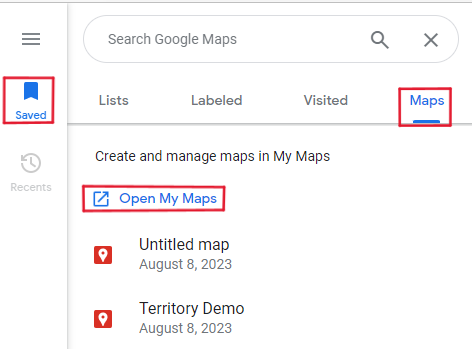
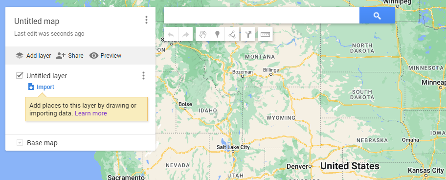
First, we will need to go and create a custom map in Google Maps. Go to your google maps and click on the saved icon. Then select Maps in the ribbon and click on the Open My Maps hyperlink.
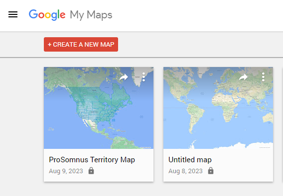
Now you will need to click on the Create A New Map button in the top left. If you already have a custom map it will appear on this screen as well.
We are now in the view that you will spend most of your time. In here you have several options of how to go forward. There are a set of buttons beneath the search bar that you can use to create your custom map. We will mainly be using the polygon and line creator button. You can also add all new layers to your map. This is helpful if you decide to import other KML data into your map as a reference. Note: If you import data it does add to your point count, and you can only import up to 2000 lines or shapes in that layer. You can also only have about 10 layers in your map at one time.
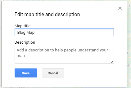
Before we start creating our shape, let’s give this map and layer a name. To do this you just click on the title of the map or layer.
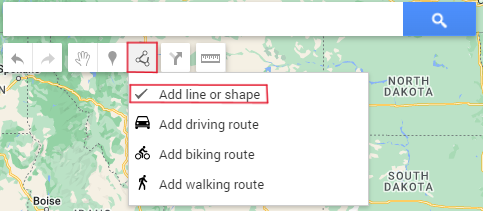
Now let’s create our first shape. If you are going to import a reference layer, now is the time to do it. First you are going to click on the line and shape tool in the top tool bar, then start selecting where you want your points to be. If you are creating a line, you just click on the last point that you want, but if you are creating a shape you finish by selecting the first point that you placed.
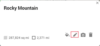
This is the example shape that I am going to use. After I clicked my last point, I was shown a box where I can change the name of this shape.
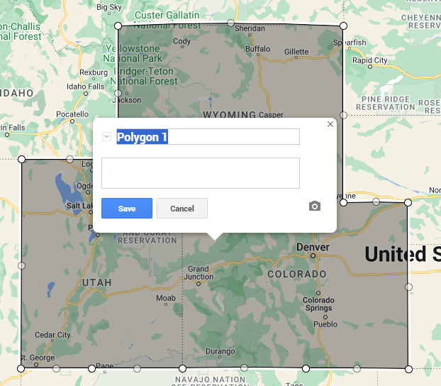
If you ever want to change the name of a line or shape after it has been completed you just select the shape on the layer, then click on the pencil icon in the box. Note: The name of your shape needs to be the same as your data. This is how Power BI creates the connection between the visual and the data.
Now you can continue to create your shapes. The time that it takes you can vary widely to how much detail you need to apply to your shapes.
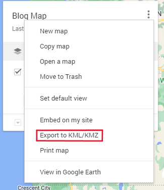
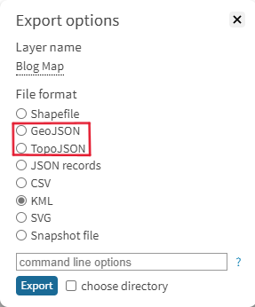
Once you are done creating all your shapes you can go ahead and export your shapes as a KML or KMZ. For this blog we will be using the KML file because it works more smoothly with this method. Click on the ellipses next to your map name and elect the export option.
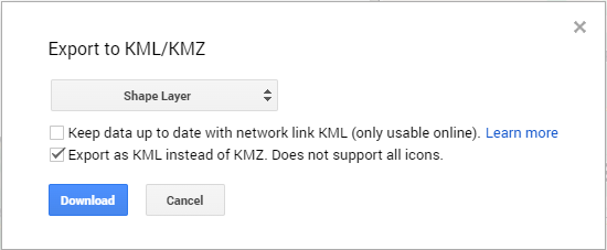
In here you have a couple of options. You can export the entire map or only a layer of that map, you can keep your data up to date (click on the learn more option if you intend to use this), and you can choose to export as a KML instead of KMZ.
I am going to choose to only export my Shape Layer and click the check box to export my file as a KML.
Once you hit the download button you should have a KML type file appear in your downloads box. I prefer to place this in a subsidiary file near my PBIX file, but this is entirely your preference.
Switching the File type from KML to TopoJSON or GeoJSON
Now that we have our final KML file we are going to convert the file from a KML to a TopoJSON and GeoJSON. Whether you choose to do one or the other will depend on your intentions with visualizations inside of Power BI.
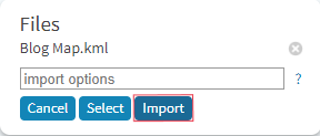
Go to mapshaper and drop in your KML file. You will get a small pop-out box that asks you about import options. Just click on Import.
Now you should see your shape appear. What you need to do is click on export in the top right corner then choose the file type that you want to export to. I will be doing both a TopoJSON and GeoJSON so I will need to do this process twice. Note: If you do both a TopoJSON and GeoJSON, there is no distinction between the two file types. So, you need to do some organizing as you go.
Importing your Custom Shape into Power BI
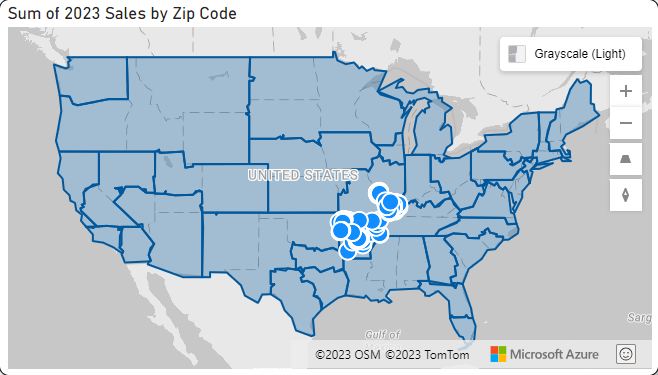
Now we are ready to get back to Power BI and start visualizing our maps. For this section I will be using a much more complex map because it looks better and shows more features, but the process is the same for both large and small JSON files. I have already created a page of visuals that I want to apply my shape to that looks like this:
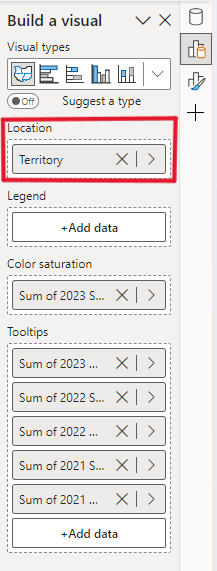
If you are using a TopoJSON file, you will need to use the Shape Map visual. This is still a preview option so you may need to go and check that (See preview features in the links at the bottom of the page).
In the shape map visual you will need to have your territory/shape names in the location. Tip: If you want a multi color map you can put the territory/shape names in the legend.
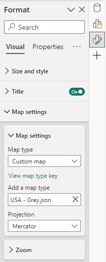
Now we can add our TopoJSON to our map. Make sure that you have your map selected then go to the Format pane and expand Map Settings. In here change your Map Type to Custom and browse for your file under the Add a Map Type. This will be the TopoJSON file for this visual.
Now your map should appear with the shapes that you have created. In here you should spend some time setting up tooltips and highlighting different shapes to make sure that you have everything on your page setup correctly.
Next, we are going to do a similar process but for the Azure Map visual. First you will need to have an azure map on your page and have some data in this. This data does not need to be able to connect to your map.
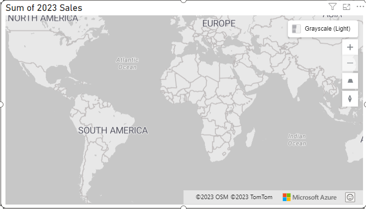
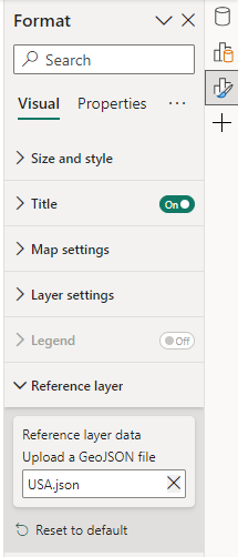
From here we can go to the Format Pane and expand the reference layer. In here you will need to find your GeoJSON file.
I have encountered some issues with the Azure map visual not loading well, but if this happens to you, when you publish your report to the service, double check that your reference layer loaded as it’s supposed to.
You should see your map appear in the visual. This is not an interactive map like the Shape map visual is, but it can be a great reference tool for your end user.
Getting the Entire List of Zip Codes from a KML File
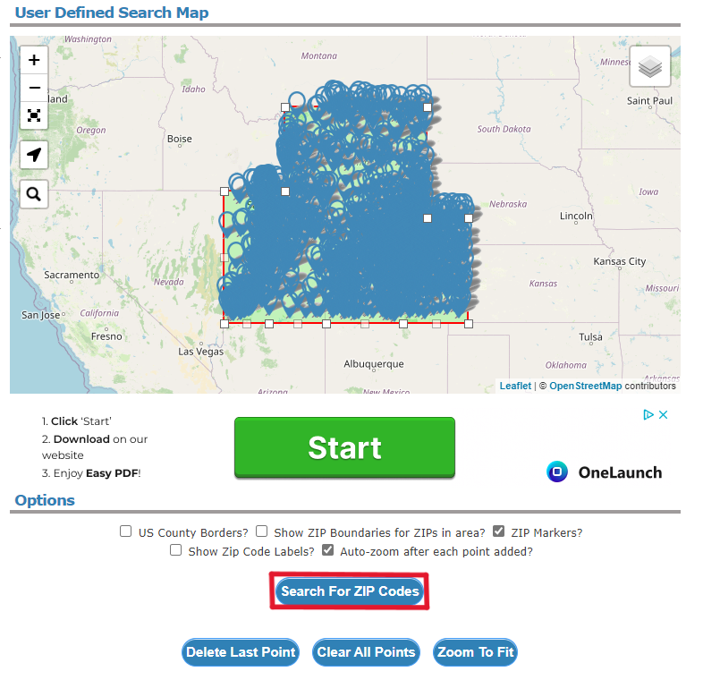
The last step of this process is getting all the Zip Codes from your shapes. I have experienced a few issues with the site that I found, but there are not many other options to do this same process.
Go to https://www.freemaptools.com/find-zip-codes-inside-user-defined-area.htm and in here you can upload a KML file. Make sure that you hit the Upload button.

Then to get your list of Zip Codes click on the Search for Zip Codes button.
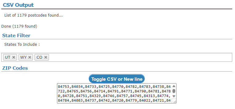
From here you can go and copy or download a csv and connect this to your data in Power BI.
Conclusion
Overall, this is a creative method that can allow you to take your reporting to a new level. While it is tedious, time consuming, and difficult, creating a custom map is something that can add real depth to a report.
Links Related to this Article:
Comments
Leave a Reply
You must be logged in to post a comment.