Power BI – Adding a Visual
BY: Morgan Lundeen
Introduction
One of the most important aspects of Power BI Desktop is the ability to add visuals to accurately represent the data and its insights. Power BI Desktop already has over thirty visuals on the platform that are ready to use, but sometimes a unique visual is necessary.
There are two ways to import visuals into Power BI desktop: through the desktop platform or through the Power BI website. This blog post will go over when to add a visual and walkthrough the two methods of adding a visual.
When To Use It
There are hundreds of ways to present data in a visual, but it is important to always choose a visual that most accurately and clearly presents the data for the story you are trying to tell. It can be fun to add bells and whistles, but if they make the information convoluted, they should be left off. That being said, there are times when the basic visual options are not sufficient and knowing how to add visuals can enhance a presentation.
Walkthrough
Method 1: Adding visuals through the Power BI Desktop platform
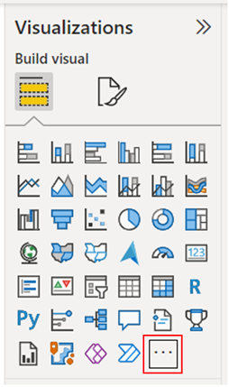
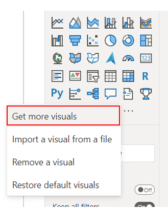
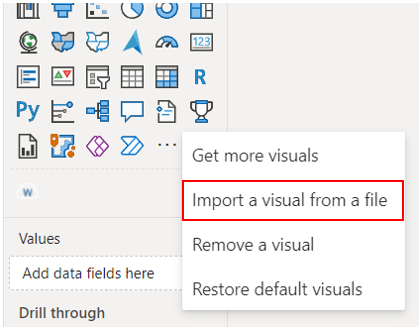
On the visualizations panel, after the list of visual icons, there is a “Get more visuals” button represented with an ellipsis. Clicking that button gives us four options, but only two for adding a visual: “Get more visuals” or “Import a visual from a file”. Importing visuals from a file will be used in Method 2, discussed below. In the first method, we can browse for new visuals and find one that best fits the data.
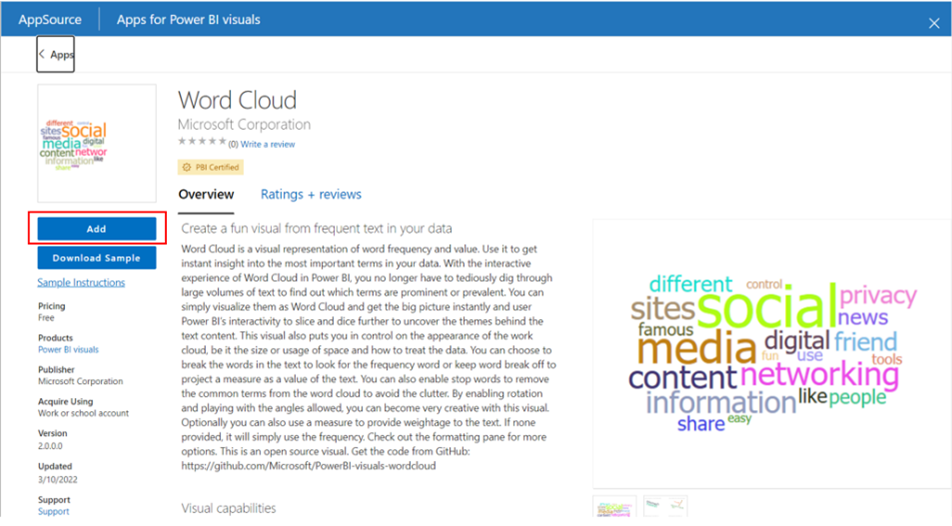
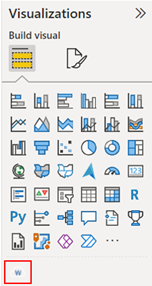
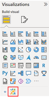
Clicking the get more visuals options results in a pop-up screen that allows us to search for more visuals within Power BI Desktop. The two tabs at the top show options for either AppSource visuals or organizational visuals. Here we can browse or search for specific visuals; in this example, we will add the Word Cloud visual, which is a helpful visual for word frequency and value. After clicking on the visual, click the Add button. The visual will then be added to the list of visuals on the Visualizations pane.
Method 2: Adding visuals through the Power BI website
The second way to add visuals is to go through the Power BI website by going to powerbi.com/visuals in a browser. This site offers ways to browse with filters or search directly for visuals. After finding a visual, click the “Get it now” button. In this example we will add a bubble chart visual. This will download the visual as a file.
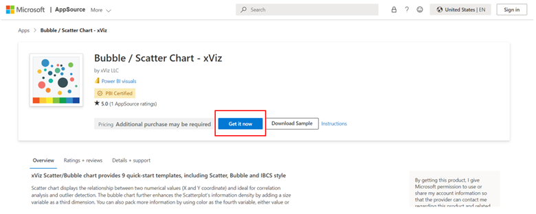
Back in the Power BI Desktop platform, we click the ellipsis button, this time clicking “import a visual from a file”. This will open our files, allowing us to import the newly downloaded visual file, in this case titled IBCSBubbleChart. This will import the visual to the desktop platform and will show up at the bottom of the list of visuals on the Visualizations pane, where it can be used like any other visual.
Conclusion
Being able to add new visuals can help us tell a story with our data or make the information unique and exciting. While there are two ways to add visuals, either through the Desktop platform or through the Power BI website, both methods bring us to the Visualizations pane with all of our added visual options at the end.
Comments
One Response to “ Power BI – Adding a Visual ”
[…] Power BI – Adding a Visual […]
Leave a Reply
You must be logged in to post a comment.