Power BI – Group and Bin Data
BY: David Rohlfs
Introduction
Are your visuals messy? Are you looking for a way to simplify your visuals for your end users? Then you have probably come across grouping or binning data. This feature allows you to take data and stick it into different sections so that you can do your aggregations off of those sections.
In this blog we are going to go over some of the reasons you will want to use Grouping and Binning data, some problems you may experience when using this feature, and a walkthrough demonstrating a couple of methods.
When to use it
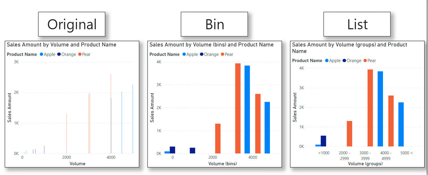
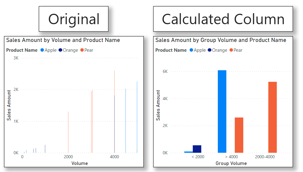
Being able to group your data and demonstrate your data in a simple manner can be the difference in an end user understanding what is happening and what the data story is. To help you understand what is going on when I talk about this, here is an image showing how this feature works:
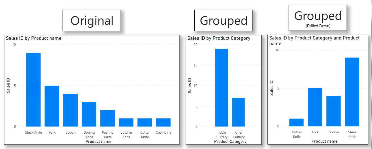
You can see the difference very easily between the two clustered column charts. The first is chaotic and busy, while the second is simple, and can be drilled down upon.
The best time to use this feature is when the same situation that occurred above happens to you. When using this feature, the end user has a much easier time reading and understanding the data, which saves effort, time, and increases simplicity.
Common Problems
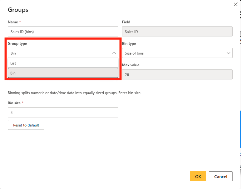
The difference between grouping a text and number is relevant when using the New Group feature. Generally, you will want to use the List option when you have text or numeric data, and Bin only when you have numeric data. When in the New Group pop-out, you can change this here:
Walkthrough
There are several ways that you can group or bin your data, but I am only going to go over the two ways that I use and are easiest to learn. The first way will be using a Power BI Desktop feature. In this we will go over both Lists and Groups. The second way will be creating a calculated column through DAX.
Using the desktop feature:
First, you will want to find the field that you are creating the group from. This should be on the right side of your screen under the Fields pane.
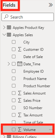
Now you can right click the field and select New group.
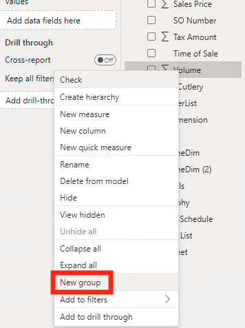
This will create a pop-out titled Groups. This is where we will build our bins and lists to use in the visuals.
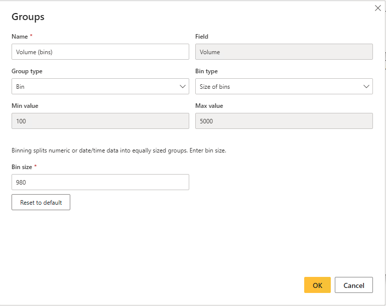
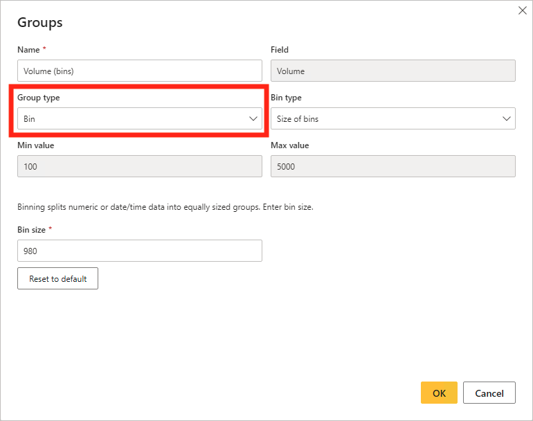
Depending on what your data is, numeric or text, you group type may appear as a List or Bin. You are able to use a bin or list with most numeric data, and only a list with text data.
Now we are going to go through the process of creating a Bin. You can go ahead and change the name of the group if you like. Your bin type will usually be “Size of bins” because this will allow for dynamic changes to occur if there is an unusual data point. We can change the bin size to a number that is easy to understand. This may be multiples of 1, 2, 5, 10, 25, 50, etc.
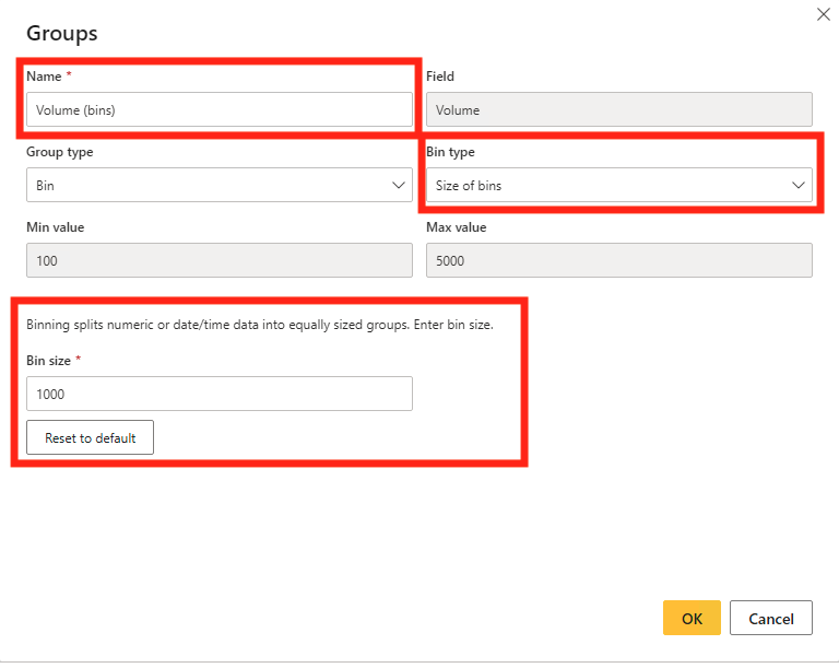
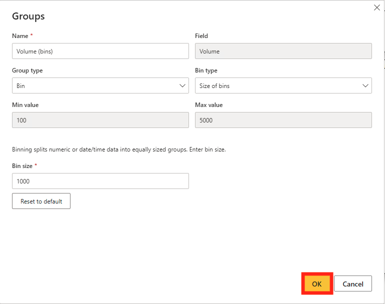
Once you are done setting up your bins, you can click OK in the bottom right corner of the pop-out.
Now we are going to go through the process of creating a List. Once you are inside of the Groups pop-out, your group type should be set to List. You can go ahead and change the name of the group if you want to. On the left you will see a set of “Ungrouped values”, and on the right the sets of “Groups and members”. To group values, just Shift Click or Ctrl Click all of the values that you would like to be grouped together then click the Group button. This will move the selected values to the Groups and Members side of the pop-out. You can rename a group by double clicking the title of the group. Whatever values that you do not put into a group will be automatically placed into the “Other” group.
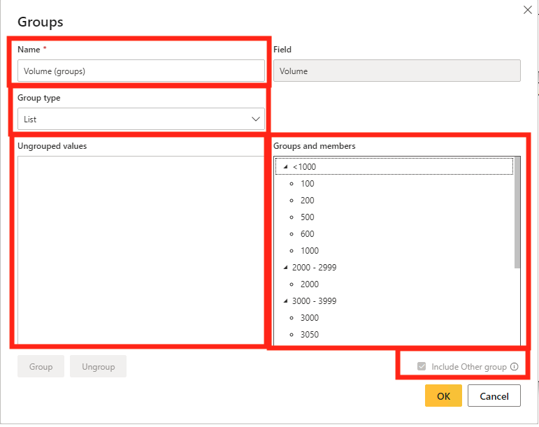
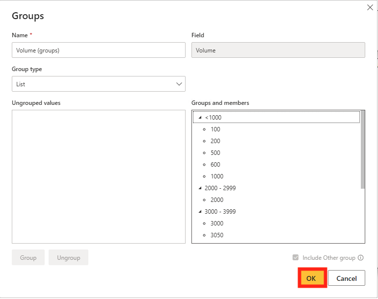
Once you are done setting up your lists, you can click the OK button in the bottom right of the pop-out.
To use your new groups, you can simply use them as you would a regular field in the fields list. I do suggest placing the original field below them to let the end-user be able to drill down to the original data, but that is up to you.
Here is a before and after of each method.
Calculated Column Method:
This method focuses on using a calculated column that separates values (numeric) between groups.
A couple of things to note when using this method:
- This will hurt performance when refreshing. So don’t use it if you have a very large semantic model or are worried about performance issues.
- You will need to have a decent understanding of DAX and your semantic model to understand this method.
- I don’t suggest using this method with a text-based column, it works much better with numeric based columns.
To start, you are going to create a calculated column in the same table that contains your field you are grouping.
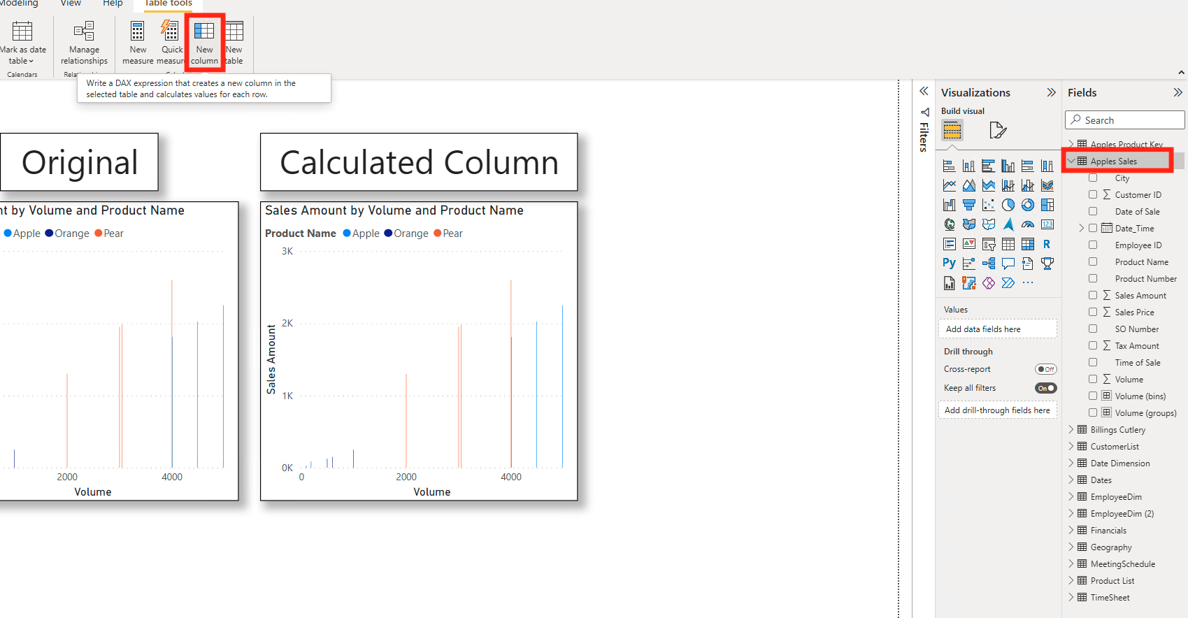
Now we can enter the DAX to create the separations. This will use a Switch () function that takes the value criteria and replaces it with a name that you specify.
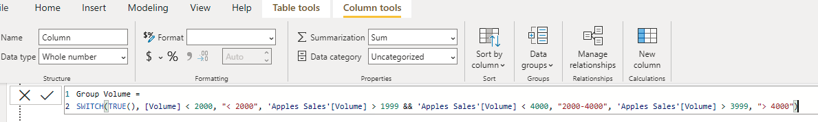
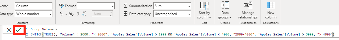
Now we can click enter or the check mark to the left of the equation.
Next, you can use the calculated column in a visual. Here is an example of the before and after with the calculated column. You can see that the way we set it up allows for a similar result to the New Group method but is much easier if you are familiar with DAX.
These walkthroughs used several concepts that EPM strategy has covered or are similar to previous blogs. If you would like to read more about them, here are some links that you can follow.
Conclusion
Using the Groups feature in Power BI Desktop may not seem helpful when dealing with such a small semantic model, but it becomes a must use when your data story is unclear because there is just too much data. This feature helps to clean up many of the pre-loaded visuals in Power BI Desktop and can help any report builder simplify a complex or busy report.
Comments
One Response to “ Power BI – Group and Bin Data ”
[…] Group and Bin Data […]
Leave a Reply
You must be logged in to post a comment.