Power BI Visual as a Tooltip
BY: David Rohlfs
Introduction
If you aren’t familiar with tooltips, then this concept will be exciting and great to learn. Tooltips in general allow for a report builder to give extensive detail into every part of their report. They can specify what a specific point acts like and some information on that point while not taking up any real estate in their report page. Being able to use another report page as a tooltip is even better because you can use your artistic formatting talent to create a tooltip.
In this blog we will cover when you want to use a visual as a tooltip and a walkthrough of developing a visual as a tooltip.
If you do not have any experience with normal tooltips, you can read this EPM Strategy blog to get an understanding on how they work. Power BI Tooltips
When to use it
Normally, I choose to avoid using visuals and other report pages as tooltips because it can take some time to set up and is outside of the scope of the report. But I really like to use this feature if I am trying to show off Power BI and tell someone about how great this tool can be.
You will likely use a visual as a tooltip if your end user specifically asked for it, you need to show more information that directly ties to the main visual, or you are trying to represent a specific aspect of information without overcrowding a report canvas.
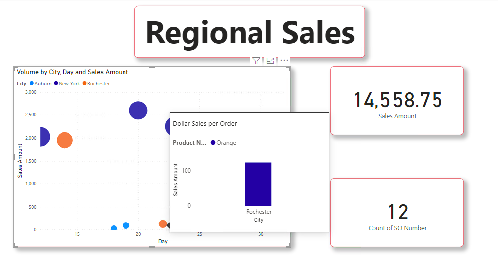
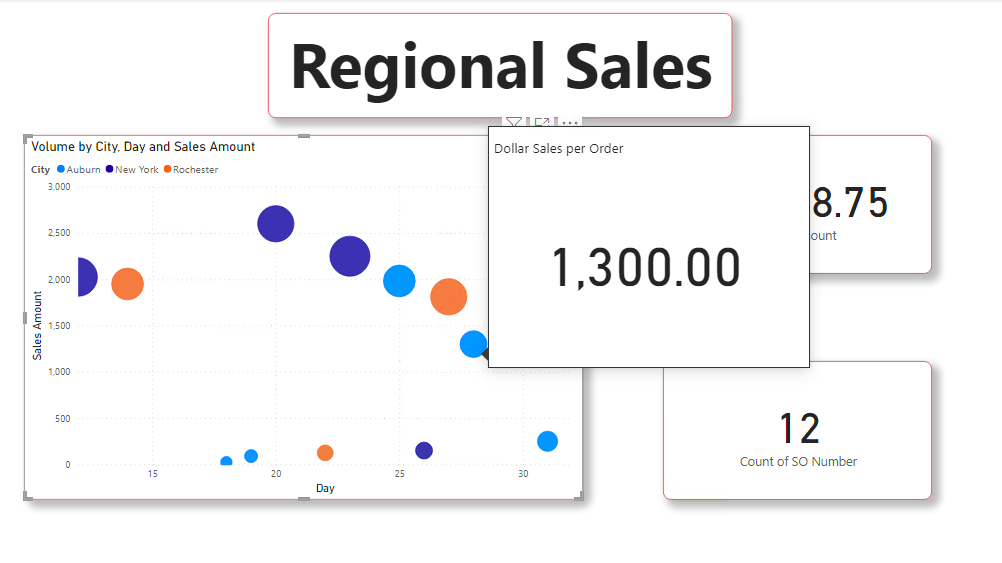
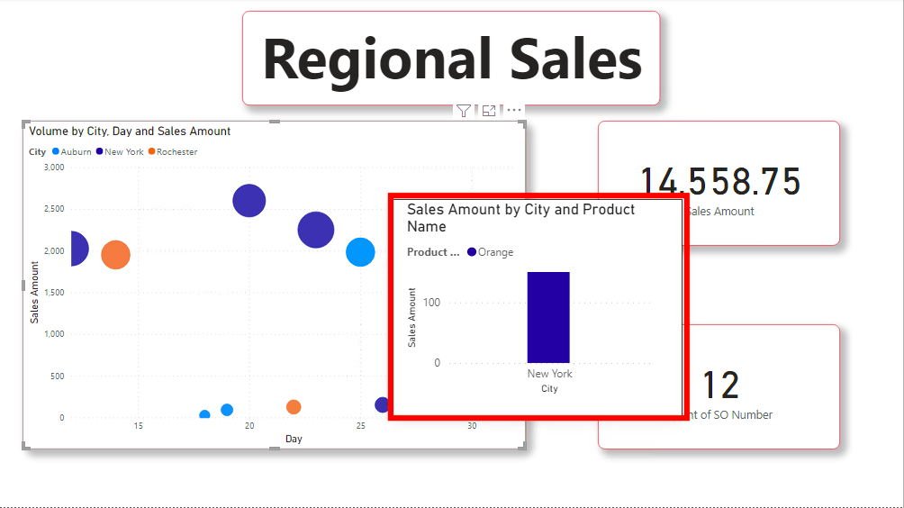
Here are a few images of using a visual inside of a tooltip:
Bar chart:
Order Cost Page:
If you do end up implementing this feature and technique, I suggest that you remember that less can be more. Do not overcrowd your report with so much information that you lose the goal of being able to communicate data effectively to your end user. This requires a lot of personal discretion and needs caution.
Walkthrough
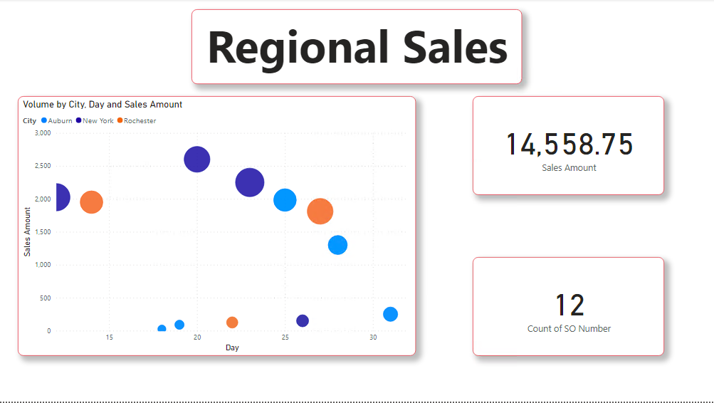
To begin I am going to make my main report page. You can do this normally as you would any report. Here is an image of what it looks like after I finish.
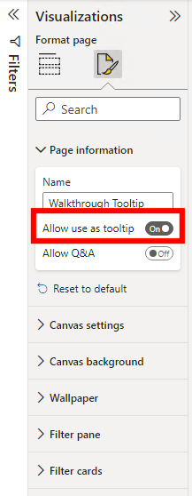
Next, create a new page and go to the visualizations tab, select Format Your Report Page, then select Page Information.
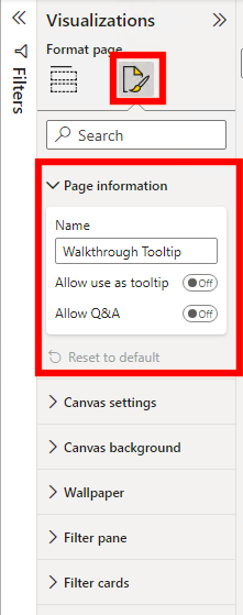
Now you can click on the Allow as Tooltip slider. Doing this will change the format of your report canvas so that you get a better understanding of the size of the tooltip.
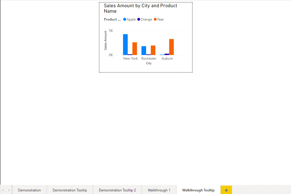
Next, we can build our tooltip. For this demonstration, I am only going to use a bar graph. This will be a similar process to building any report page except that there is very little real estate to work with.
Now we can go back to our main page and select the visual that we are going to use the tooltip on. Then click to format your visual in the visualizations pane.
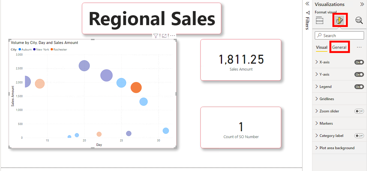
Go ahead and select General, Tooltip, and select the page that you want your visual to represent inside of the tooltips.
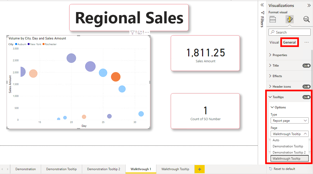
This is what your visual should look like after you finish.
Conclusion
This is a great feature of Power BI and has so much wow factor for many people that haven’t been around report building tools before. Just remember to not let this feature tarnish the simplicity that your report may have.
Comments
Leave a Reply
You must be logged in to post a comment.