Power BI Tooltips
BY: David Rohlfs
Introduction
When building a report, the report builder usually knows the data very well, and can build very complex reports because of it. But this doesn’t help the end user if they can’t understand what the report builder is trying to convey. One of the ways that Power BI Desktop has tried to solve this is by allowing tooltips in a report. Tooltips show supporting data when you are hovering over a datapoint, or over a visual.
When to use it
Tooltips are very helpful when the data is too complicated, or too detailed, on its own. Tooltips can show extra data that is important to the end user without creating more graphs and allowing the report builder to use graphs that display the data proficiently without tables.
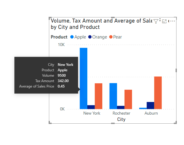
You can also use tooltips when you feel that there isn’t more room for graphs on your report. Tooltips can save space on your report by showing relevant information to the visual without wasting space. For example, here is a chart with all the information slots filled, but I still want to show the sum tax amount, and the average price per unit.
Tooltips can do all sorts of aggregations for a field, and whatever they can’t do, you can still use DAX for. Tooltips can show:
- Sum
- Average
- Minimum
- Maximum
- Distinct Count
- Count
- Standard Deviation
- Variance
- Median
Walkthrough
In this walkthrough we are going to go through a demonstration on how to add tooltips into an existing visual, and how to change the aggregation inside of them.
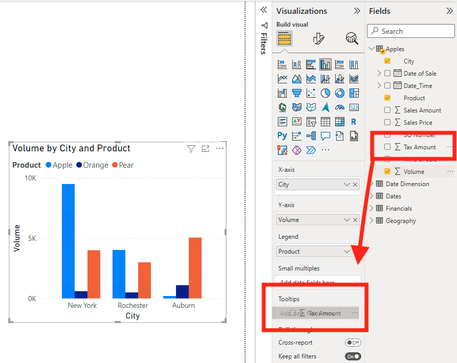
After you have created your visual, drag the field that you want in your tooltips to the tooltips box. For this demonstration, I am going to place my Tax Amount field in the tooltips box.
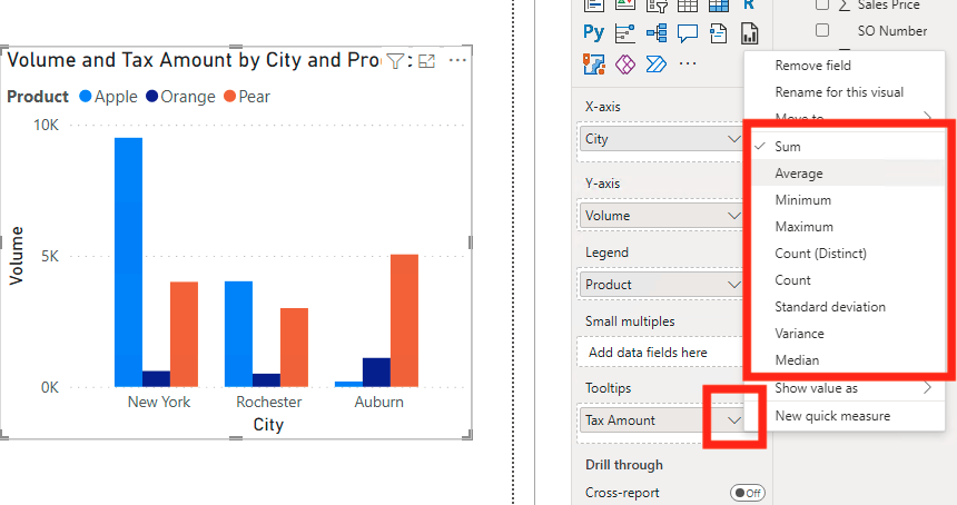
Now we are going to change the aggregation to the Tax Amount field. Notice that the aggregation automatically sums the field for us. To change the aggregation, click on the arrow next to the field name, and a list of aggregations should pop up. I am going to choose to average the amounts, but you can choose any of these.
Now if I hover over my visual on a data point, I will see my tooltips appear. See that the tooltips also show the data that is already placed into the visual.

Conclusion
Tooltips are very simple but can add to the report a lot. They allow you to explain your data and visuals, without writing out text. Although they are very simple to use, they are very helpful to the report builder and end user.
Comments
2 Responses to “ Power BI Tooltips ”
[…] If you do not have any experience with normal tooltips, you can read this EPM Strategy blog to get an understanding on how they work. Power BI Tooltips […]
[…] Tooltips […]
Leave a Reply
You must be logged in to post a comment.