Power BI Using the Analytics Tabs for Visuals
BY: David Rohlfs
Introduction
There are a lot of features in Power BI that a report builder can overlook or forget about when they build a report. One of those features will often be the Analytics tab in the Visualizations pane. This pane can add static information to a visual and help to demonstrate important data details to an end-user.
Because this feature covers multiple functions, this blog will only be explaining a brief overview of the functions in the analytics pane.
In this blog we will go over when to use the Analytics tab and explain how some of the functions can add to a report.
When to use it
The Analytics tab is available on select visuals in the report page. When you do have access to the analytics tab, the available options will change depending on the visual that you have selected. This is the same as how the Build Visual and Format Visual tabs work.
The difference with the analytics tab is that we are not changing any of the data, but instead showing important information that there may not be a field made for. Using this tab can reduce the number of measures that you need in a report and reduce the amount of time it takes to create in-depth visuals.
To access the Analytics tab, you need to select a visual and click on the icon in the Visualizations pane.
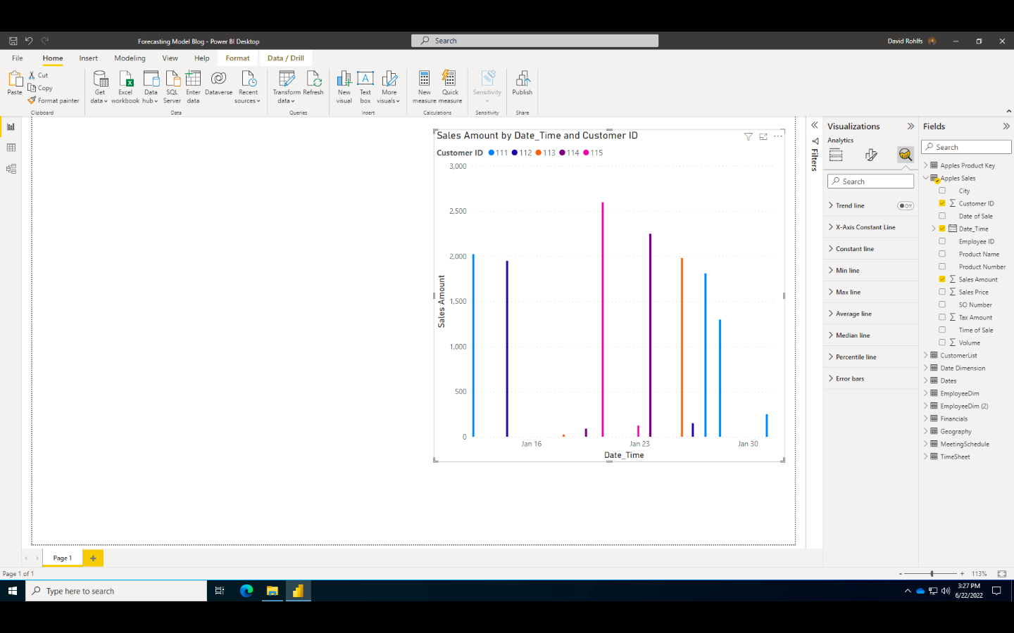
Depending on the visual you have selected, you may see these options:
- Trend Line
- This option shows a line that points in the direction your data is trending towards.
- This can help to demonstrate a fields success and future predictions.
- X-Axis Constant Line
- This will display a vertical line on your X-Axis.
- You may use this to show that a time before or after a date should be excluded from the main portion of data.
- Constant Line
- This will display a horizontal line along your Y-Axis.
- You may want this to show the bottom line of sales that your department needs to stay afloat.
- Min Line
- This will display a line on your minimum value.
- Max Line
- This will display a line on your maximum value.
- Average Line
- This will display a line on your average value.
- This can make it easy for an end-user to identify the average amount of sales a product has.
- Median Line
- This will display a line on your median value.
- Percentile Line
- This will display a line on a percentile of your data that you specify.
- This can become useful if you want to see when a product went above a percentile of sales.
- Error Bars
- This can display a margin of error in your data.
- Symmetry Shading
- This easily shows which values are closer to the X-Axis and Y-Axis fields.
- Forecast
- This can help show forecast predictions for a visual.
- Find Anomalies
- This can simplify finding anomalies in your semantic model.
Conclusion
Although there are a lot of options for using the analytics tab, it can often go unused in a report. Because a goal of a report builder is to simplify end-user readability, the report builder should actively try to learn more about the correct uses and important factors of the data. This can often mean using the analytics feature to show important information to an end-user and reduce the amount of time it takes to understand a visual.
Comments
Leave a Reply
You must be logged in to post a comment.