Power BI Report (Visuals) Versus Table Versus Query Versus Transform Data Versus
BY: Collin Quiring
In Power BI we have a few views on the left side of the main screen, and we have the Edit Queries/Transform Data option as well elsewhere. What is the difference? What do they each do? What is the main purpose of each?
In Power BI Desktop, there are three icons on the left side (in default view).
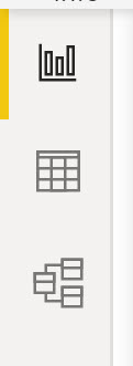
These icons are called (Top to Bottom):
Report (sometimes called Visual)
Data (sometimes called Table)
Model (sometimes called Relationships)
There is also an ability to get to the Query Editor through the Transform Data icon. On the main screen of the Desktop tool for Power BI is the Home tab on the ribbon. On that ribbon, is the Transform Data (used to be Query Editor) icon.
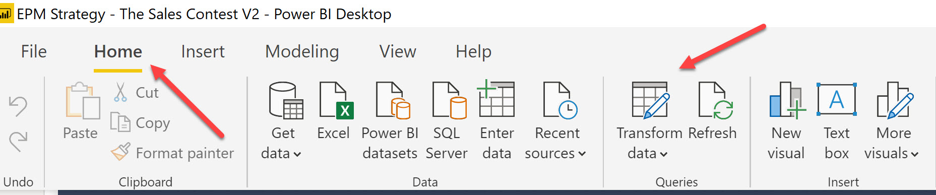
Let’s start with the Transform Data icon which opens the Power Query Editor window. This is a new page that opens. This is where we manipulate the Query. This includes the Applied Steps, Query Settings, Advanced Editor, a Data Pane in the middle and the Queries Pane on the left.

This is where we can manipulate data in whatever ways needed. This is affecting columns of data and we can add or remove columns. The Applied Steps show what we have done to the query in question and the Data Pane shows us the effect of our changes to those columns. Once complete, we can Close and Apply our changes so that the data modifications that we have done are available in the Report (often called the Visual) page.
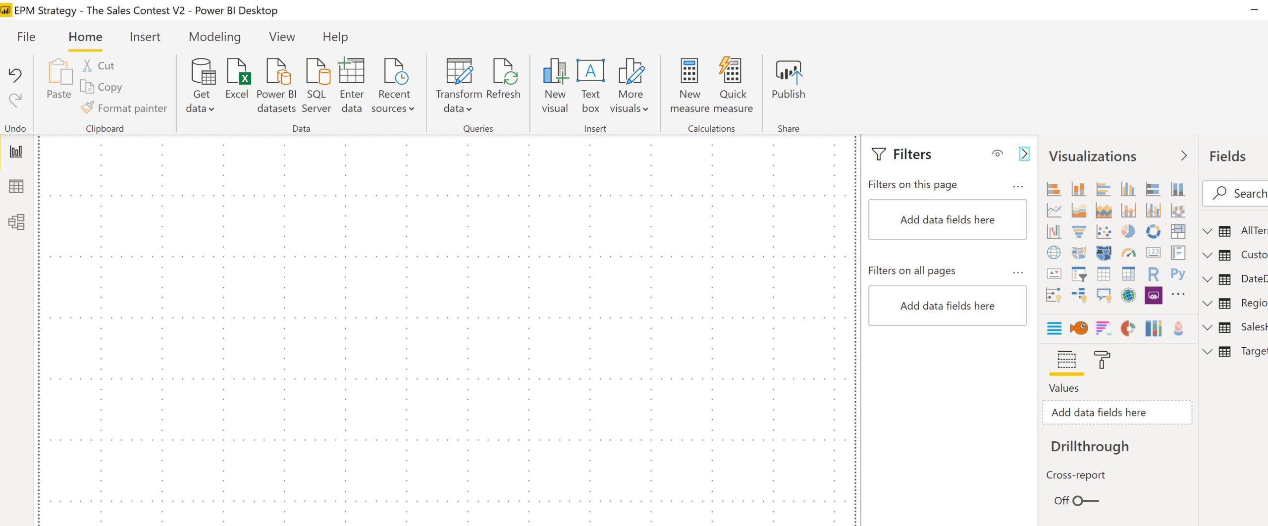
Once the modifications made to data are completed and applied, we are back to the three main views on the first page – Report, Data and Model
According to Microsoft, “the Report view is where you use queries you create to build compelling visualizations, arranged as you want them to appear, and with multiple pages, that you can share with others.” This is why this is often called the Visuals page – because this is where the visuals reside. Before we do anything, this page (current default view) looks like this (with Gridlines turned on):
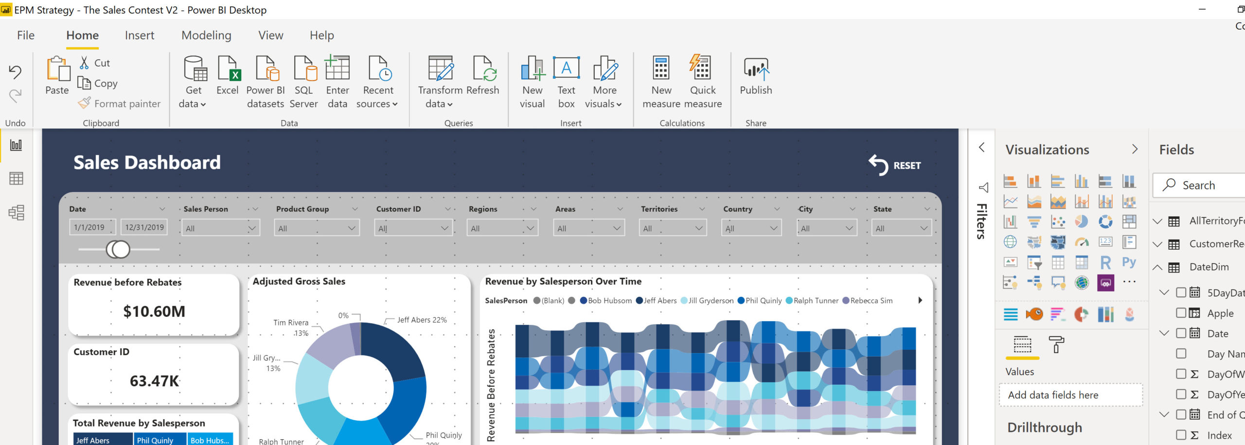
This is where we can modify Filters, Visualizations, select fields for the visualizations and insert various items. This is also where we create Measures, Quick Measures and we can even create new columns. NOTE – these added fields (Measures or Columns) are NOT in the query editor. They are not part of the data that we brought into the Power BI report – these are items that we have made “on the fly” and are available and calculated only in the Visual/Report view. There are many article on the reason and times it is better to create a column in the Transform Data/Query Editor versus as a Measure or Column in the Report/Visual view so we will not get into that here.
This is one example of what a “completed” Report view may look like with Visuals, slicers and measures or columns added.
The Data view is often called the table view because it looks like a table and it is AFTER the modifications from the Query Editor. According to Microsoft, “Data view helps you inspect, explore, and understand data in your Power BI Desktop model….With Data view, you’re looking at your data after it has been loaded into the model.” This is what an example of the Data view looks like. The columns of data are in the middle and the fields list is on the right.
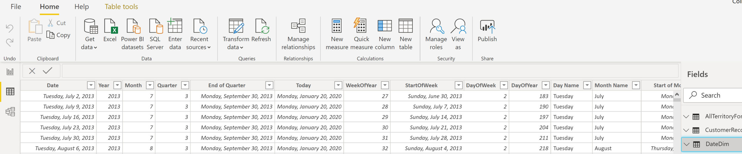
There is less functionality to make modifications in the Data view than is available in the Query Editor. However, you can make a few modifications in this view if you choose to do so.
The third view is the Model view and is often called the Relationships view because it shows the relationships between the tables (and partly because I think it used to actually be called “Relationships” by Microsoft) . According to Microsoft, the relationships view is to “…get a graphical representation of the relationships that have been established in your data model, and manage or modify them as needed.”
This is one of two places to modify relationships. As an example, the model view can look like this:
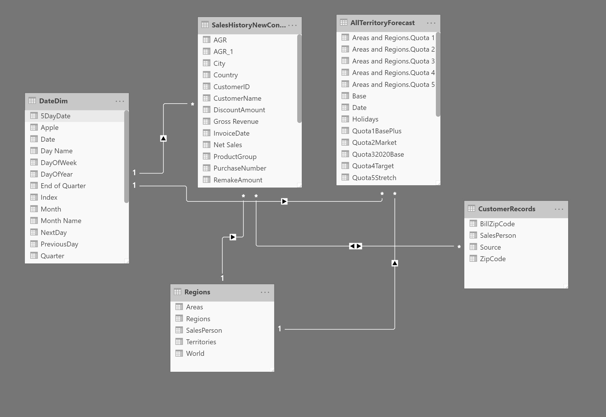
The “1” on the line represents the “one” part of the connection and the asterisk “*” represents the “many”. The arrow(s) on the line show the direction. When you highlight a line it also shows the key fields that are being used for the connection. In this example, the field “Date” from the “DateDim” table connects “one-to-many” to the “Invoice Date” field in the “SalesHistoryNewContact”.
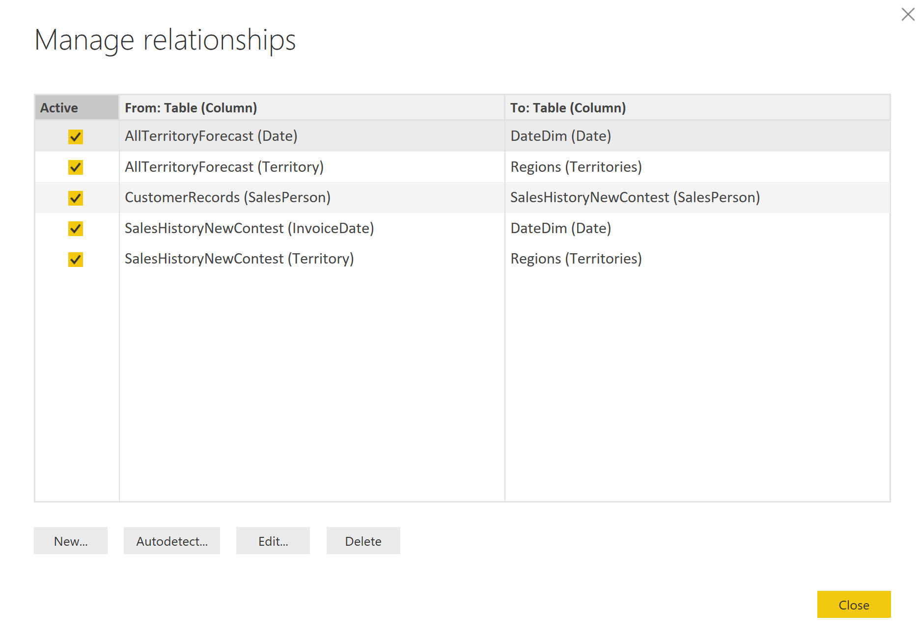
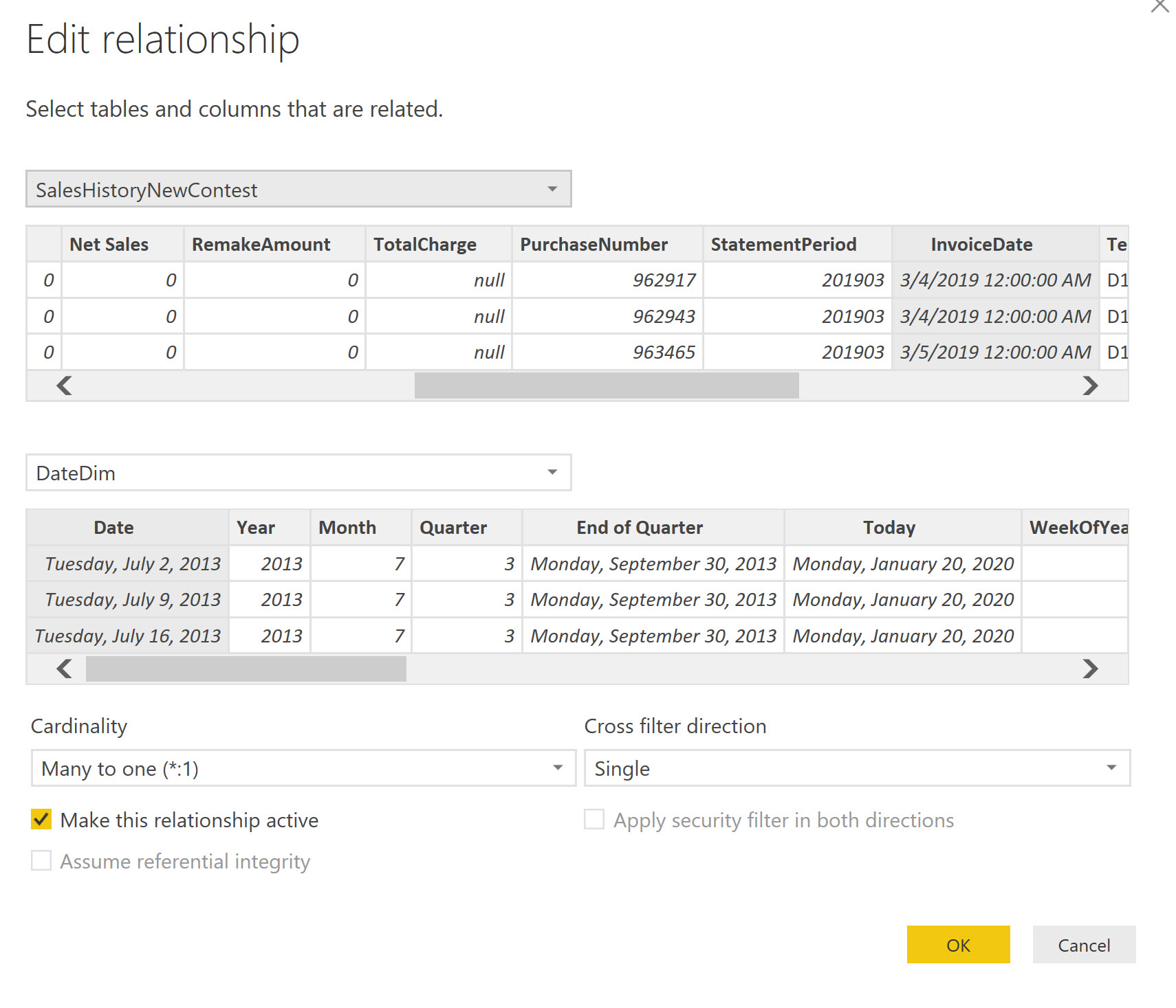
And, you can drill down to look at the exact connection – in this example, the Date Dim and SalesHistoryNewContest in the Manage Relationship view:
Now that you understand the basic difference between the main view types, you can better select which view to use for what type of work you are trying to accomplish!
Comments
Leave a Reply
You must be logged in to post a comment.