Power BI – Admin Portal – Usage Metrics
BY: Collin Quiring
This article is about the overall Power BI Usage Metrics and is not about the usage metrics for a specific dashboard/workspace.
To get to the Usage Metrics, go to the Settings Sprocket in the top of the Power BI Service screen. And select Admin Portal. The first item on the top left choices is the “Usage Metrics” screen.
This is a sample of what the whole screen will look like (as of today since more variables may be added in the future).
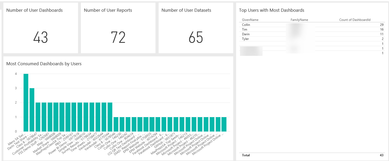
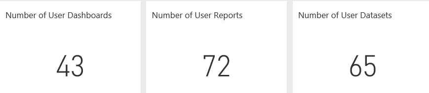
Breaking down the sections explains what we are seeing. The first three boxes are the Number of User Dashboards, the Number of User Reports and the Number of User semantic models. These are fairly self-explanatory as these are giving a DISTINCT count of those items in the overall workspace (not just one workspace).
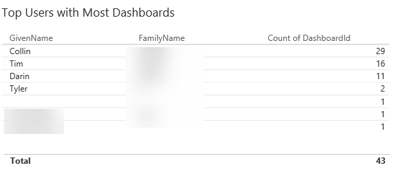
On the right side are the users with the Most Dashboards. These are dashboards they have created and that they have had shared with them.
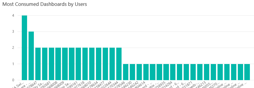
Under the Distinct counts is the chart for the Most Consumed Dashboards by Users. This is showing the dashboard that has had the most views.
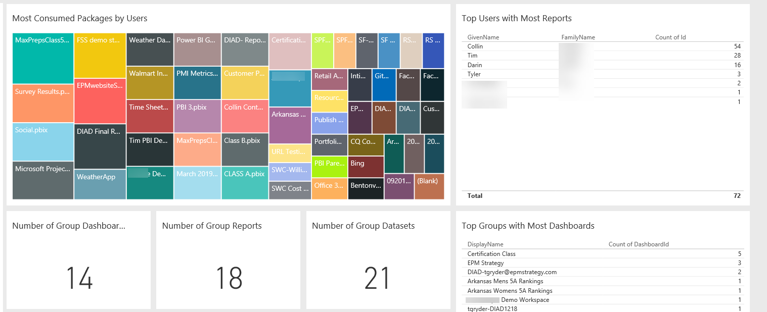
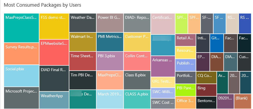
The next section is about the Most Consumed Packages by Users. This is showing us the most connected to content. This is via the Get Data process so it includes content packs, files and databases.
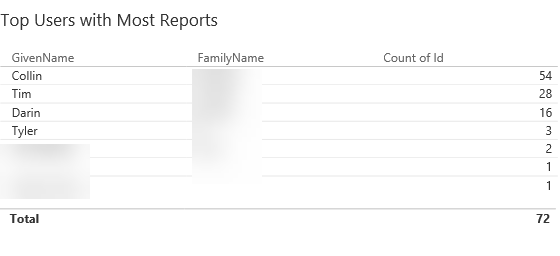
To the right of that report is the Top Users with Most Reports and is based on how many reports that each user has.
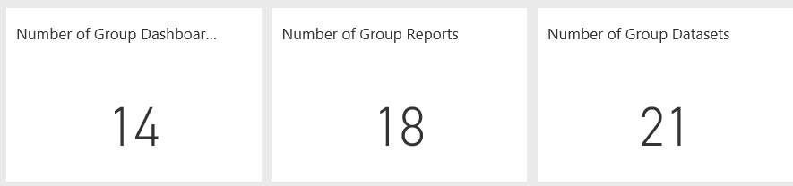
Below the Most Consumed Packages report is the group section – this is data that is fairly similar to the information above but is based on Group information. Instead of Number of User Dashboards, or user reports, or user semantic models these boxes show the distinct Number of Group Dashboard, the Number of Group Reports and the Number of Group semantic models. The “Group” is “distribution groups and mail-enabled security groups to appear in your groups list.”
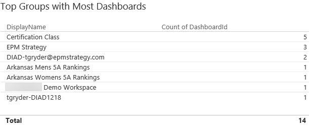
To the right of that is the Top Groups with the Most Dashboards
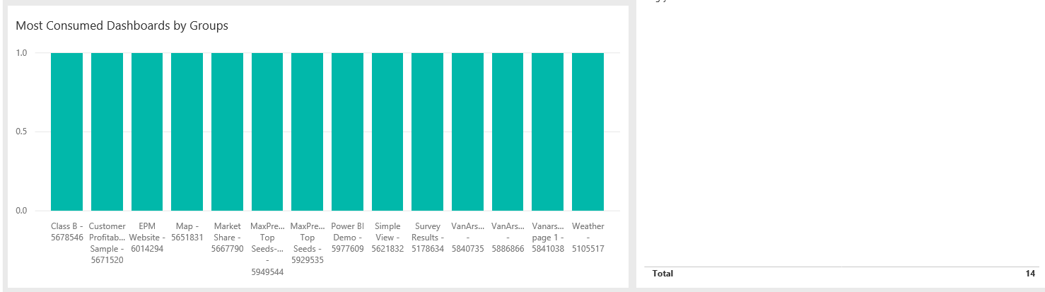
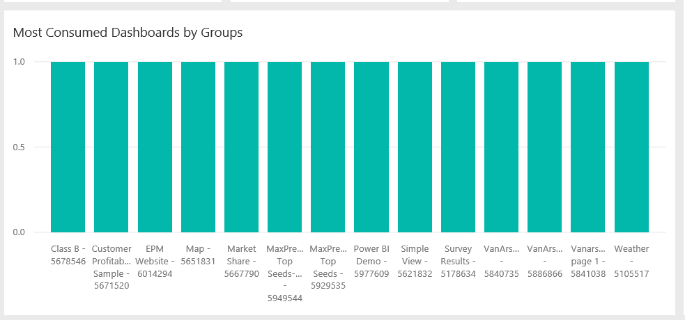
Below the Numbers and to the left of the Top Groups is the Most Consumed Dashboards by Groups.
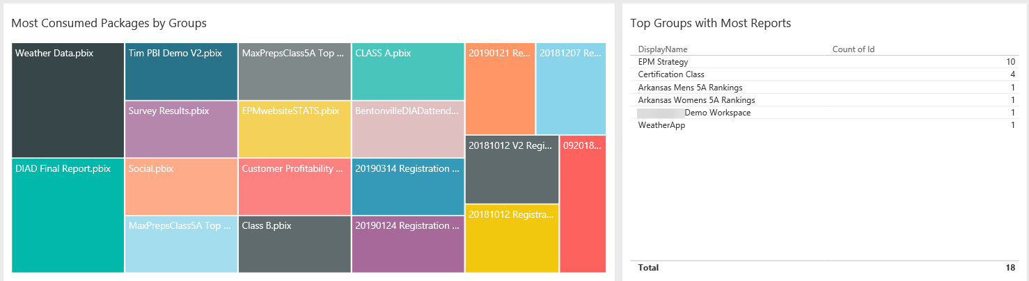
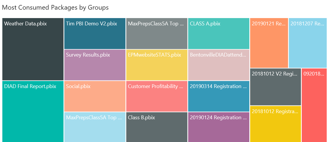
And beneath that chart is the Most Consumed Packages by Groups report.
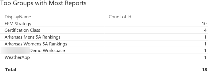
To the right of that is the Top Groups with Most Reports report.
When the updated reports come out, I will create a new blog and put a reference to it here. In the meantime, I hope this helped understand some of the reporting that is available!
Comments
Leave a Reply
You must be logged in to post a comment.