Power BI Creating a Theme
BY: David Rohlfs
Introduction
One of the fun parts of building a report is when you are designing the pages themselves. When designing the report, you get to make a page layout, choose your visuals, and set the theme of your report. Although creating a theme is superficial to the meaning of the data in a report, it is a way that report builders can increase a reports wow-factor for any end-user.
Because it takes so much time to manually change each visual that you have in a report to match your theme, it is good practice to create your own theme or choose one from the selection Microsoft has already made available.
This blog will only be covering custom themes for Power BI Desktop. If you want to learn more about themes, you can read this Microsoft Doc on Use Report Themes in Power BI Desktop.
In this report we are going to go through when to use a theme, and two ways that you can make a theme for your report.
When to use it
Themes are not going to deal with any data or alter the information of your report, and because of this you can make them at any point in creating your report. Though you can make the theme once you have already created all your visuals, it is a good practice to make a theme before this.
When you create a myriad of visuals in a report and want to change a theme to all of them, you might need to go through every visual and change the color that was applied to it. To avoid this painstaking process, you can create a theme at the start and copy and paste a visual, so you only need to change the title and the fields. This is good practice because of the amount of time it can save any report developer.
To give an example of the power that having a theme in your report has, here is an example of a page with no color, a page that has color but no specific theme, and a page with a color theme.


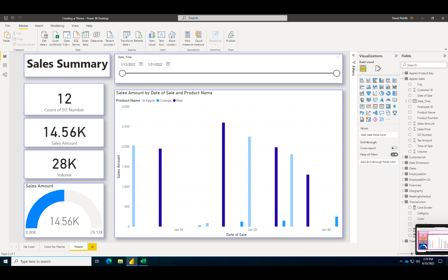
Color in a report is great at catching your attention on visuals that can easily be overlooked. In the above screenshots, all the visuals are the same and have the same layout, but it is simple and exciting to see a report that looks good.
Walkthrough
In this walkthrough we will go through two methods of creating a theme. The first one will be the way that is already built into Power BI Desktop in the theme selection options. The second one will be using a table and conditional formatting to add color to a visual.
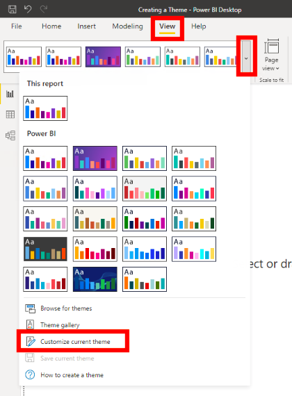
For the first example, we are going to select the View tab, and click on the dropdown for Themes. Then select Customize Theme Color.
Now we will have a pop-out window that allows us to alter all our colors. In this screen, we change each of the eight main colors, and a couple of the other color fields as well. You can also give a title to your custom theme.
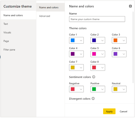
This is a great way to change a theme if you are not used to conditional formatting, or if you are almost finished with a report.
For the second example we are going to create a table that we use for a conditional formatting field to apply color to our pages. This method is very useful when you have a client or end-user that wants to apply their own colors to a report, but you don’t want to take the time to check all the visual’s colors are correct. With this method you just need to change the color in the table and refresh so that your report colors will automatically change.
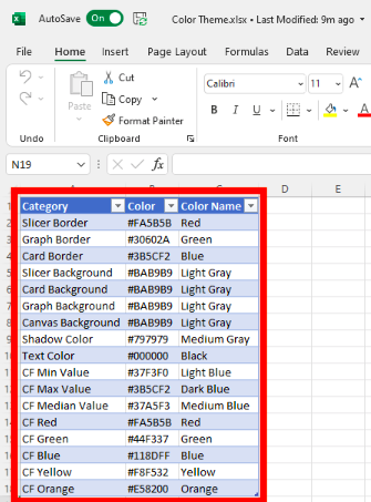
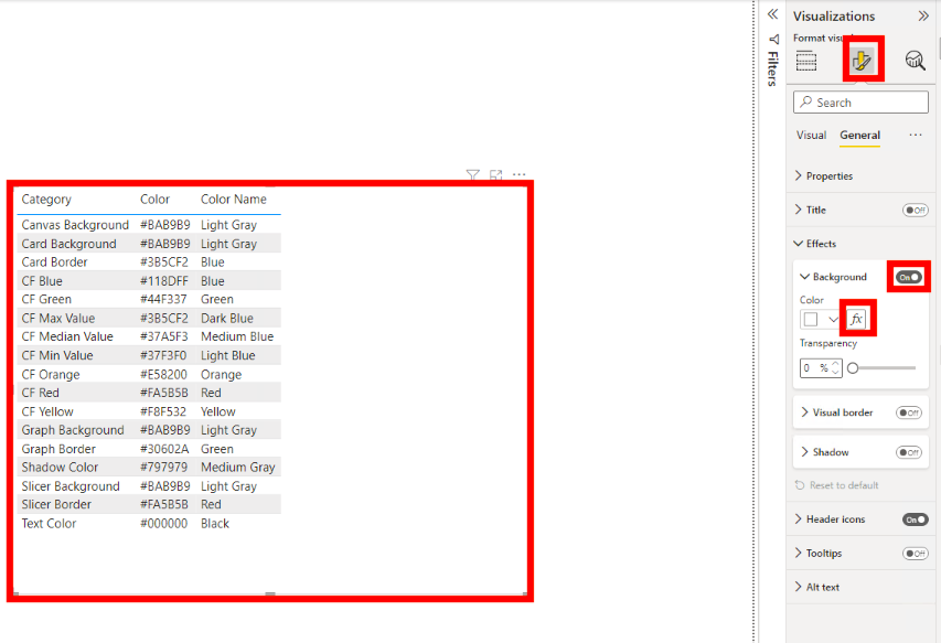
First, we are going to create a table in Excel. You can do this in Power BI Desktop, but it will be easier in the future if you already have a template that you like to use in a separate Excel file. This table will have three columns. One for the category, the hex triplet color (six-digit code that represents a color), and the color name. For my table name I want to make sure that I am representing what this table is, so I am naming it “ThemeColors”.
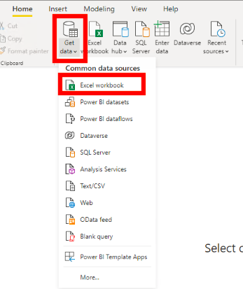
Then we will go into Power BI desktop and import the excel file into our data.
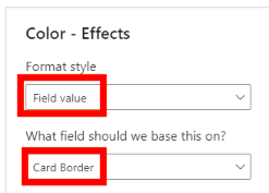
Now we set up measures to reflect each of our categories. To do this we will use a Calculate () function in DAX for the colors in a report then filter by a category.
![]()
Next, we can go into our borders, backgrounds, shadows, etc. and apply our measures to the color.
After you go through the process of applying all of your measures, this is what you page can look like.
Although this process is time consuming on the original setup, there are a lot of time saving opportunities after you do it the first time.
- The table only needs to be set up once. Then you can change the colors yourself and contact the end-user for a color palette that they use. I suggest placing this table on a cloud service like Microsoft OneDrive so that you do not need to send the table file with the PBIX file.
- The measures only need to be written once. You can easily save the formulas in a separate Word document or create the measures in a template file that you use in future projects.
- You only need to apply the colors once in the conditional formatting. If you copy and paste your visuals, then you only need to go through the conditional formatting steps once.
- If you do change your colors, all you do is refresh the ColorTheme table. This can drastically save you time if an end-user came to you and said that they want to change the colors in a report. Remember that you may be using the same table in more than one PBIX file, so you would need to make a new file if you are switching any of the colors hex triplets. This will avoid any unwanted changes in unrelated reports.
Conclusion
Although many report builders aren’t artists or necessarily the most color creative people, creating a theme can be a way to elevate any report. It is extremely simple, and there are many time saving opportunities when you do this.
Comments
Leave a Reply
You must be logged in to post a comment.